Question

Is it possible to return FME 24 to a Classic View?


milo89
Enthusiast
Forum|alt.badge.img+16

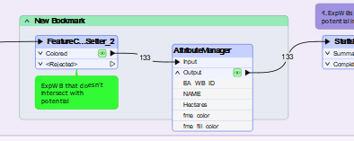
I’ve been dabbling in the latest release of FME Form 2024 for a little while now and I’m just not getting the benefits of the new look, specifically the removal of colour from most icons.

I could go into personal reasons why colour helps myself with attention to detail, concentration and focus but I’m just wondering if it’s possible to get a classic look while utilising any new functionality.

23 replies

jeroenpeters
Contributor
Forum|alt.badge.img+4
  • Contributor
  • April 16, 2024

Color themes would be a nice addition.


kumudan
Contributor
Forum|alt.badge.img+3
  • Contributor
  • April 16, 2024

Seriously!! I have downgraded to FME 2023 just for that reason. Different strokes for different folks, so why not provide an option to change the appearance, themes, icons, etc. Or just call it FME 1994!


redgeographics
Celebrity
Forum|alt.badge.img+47
kumudan wrote:

Seriously!! I have downgraded to FME 2023 just for that reason. Different strokes for different folks, so why not provide an option to change the appearance, themes, icons, etc. Or just call it FME 1994!

Ooof, FME 1994 would have been command line and hand-coding mapping files 


milo89
Enthusiast
Forum|alt.badge.img+16
  • Author
  • Enthusiast
  • April 17, 2024
jeroenpeters wrote:

Color themes would be a nice addition.

Bit of a blast from the past question but would be nice to have some personalisation or classic themes available.


kalbert
Contributor
Forum|alt.badge.img+11
  • Contributor
  • April 24, 2024

I’m wondering what human factors analysis drove the result to remove the colors from the navigator objects and other icons? My feedback to the visual designers at safe: Essential objects like Readers and Writers ae now barely to distinguish compared to previous versions.

Bringing back the icon colors would be a great support.


milo89
Enthusiast
Forum|alt.badge.img+16
  • Author
  • Enthusiast
  • April 24, 2024
kalbert wrote:

I’m wondering what human factors analysis drove the result to remove the colors from the navigator objects and other icons? My feedback to the visual designers at safe: Essential objects like Readers and Writers ae now barely to distinguish compared to previous versions.

Bringing back the icon colors would be a great support.

I’m generally interested in that too. The blog post states “This redesign was informed by an extensive audit and feedback from our community, reflecting our commitment to not just meet, but surpass your expectations.”

The title mentions focus but I find it so bland that it doesn’t drive focus and useability but reduces it.

Either way, I’ve created an idea to provide theme selection to at least offer users the choice of colour vs simplistic.


philippeb
Enthusiast
Forum|alt.badge.img+17
  • Enthusiast
  • September 12, 2024

I totally agree to that! I’m always like “heee where are you Reader?? Oops that’s the garbage...” 

That makes me remember Microsoft taking off the HOME button in Windows 8… haha what a disaster!


p_c_20
Contributor
Forum|alt.badge.img+8
  • Contributor
  • March 3, 2025

Just got the 2024 upgrade. Agree with everything said thus far in this thread. The font is somehow much harder for me to focus on, and overall, it looks like the UX team decided to check out the year 2002. Or earlier. Also, why change the inspect data icons from the magnifying glass? That smacks of change for the sake of it, and is as welcome as Microsoft unnecessarily substituting daft icons for the words ‘cut, copy, paste’. So established users have to do that translation. It’s no longer as intuitive. Changing seemingly small things like moving the transformer cog to the left matter to seasoned users. 

Let’s have a ‘pre-2024 skin’ button. ASAP. If org policy allowed me to revert to 2023, I’d do it now. I have neurodiversity issues, and like many neurodivergent folk, familiarity is super-important. 


p_c_20
Contributor
Forum|alt.badge.img+8
  • Contributor
  • March 3, 2025
kalbert wrote:

I’m wondering what human factors analysis drove the result to remove the colors from the navigator objects and other icons? My feedback to the visual designers at safe: Essential objects like Readers and Writers ae now barely to distinguish compared to previous versions.

Bringing back the icon colors would be a great support.

That’s a massive retrograde step IMHO. Formerly, I could go where I needed at a glance. 


p_c_20
Contributor
Forum|alt.badge.img+8
  • Contributor
  • March 3, 2025

This is easy to read, and easy on the eye: 
 

This, on the other hand, attacks my retinas with a brick: 


The emboldened text inevitably fuzzes out way more quickly as you pull back the zoom. 


ebygomm
Influencer
Forum|alt.badge.img+31
  • Influencer
  • March 3, 2025

I don’t see any bold text in 2024.1


p_c_20
Contributor
Forum|alt.badge.img+8
  • Contributor
  • March 3, 2025
ebygomm wrote:

I don’t see any bold text in 2024.1


Well, that is odd. 


AliAtSafe
Safer
Forum|alt.badge.img+19
  • Safer
  • March 6, 2025

Hello all.

Thank you for your feedback, we always appreciate it. Seeing that the feedback here got traction to bring theming that was available in FME in the past and overall experience with 2024.1 and its theming (let me know if I missed or misunderstood something).

Hi, ​@milo89. If you haven’t already, I’d recommend to create an Idea as this will reach to a broader audience and our team. Let me know if you need help around that. Folks here too can leave their comments and ideas in the reply section too once the Idea is created.

Also, don’t hesitate to let me know if you have any other questions or concerns.

Thanks all!


milo89
Enthusiast
Forum|alt.badge.img+16
  • Author
  • Enthusiast
  • March 6, 2025

@AliAtSafe That’s the annoying thing. I created an idea, it started getting votes (clearly because of the feedback here) and it was merged with another idea that was simply to bring back colours. While I understand bringing back colours was a part of it, it wasn’t the same as bring back a classic theme.

You don’t get asked whether you’d like to merge, it just happens and you can’t un-merge them.

Please let me know if you can actually unmerge an idea so it’s not a complete repeat of time and effort.


milo89
Enthusiast
Forum|alt.badge.img+16
  • Author
  • Enthusiast
  • March 6, 2025
milo89 wrote:
kalbert wrote:

I’m wondering what human factors analysis drove the result to remove the colors from the navigator objects and other icons? My feedback to the visual designers at safe: Essential objects like Readers and Writers ae now barely to distinguish compared to previous versions.

Bringing back the icon colors would be a great support.

I’m generally interested in that too. The blog post states “This redesign was informed by an extensive audit and feedback from our community, reflecting our commitment to not just meet, but surpass your expectations.”

The title mentions focus but I find it so bland that it doesn’t drive focus and useability but reduces it.

Either way, I’ve created an idea to provide theme selection to at least offer users the choice of colour vs simplistic.


@AliAtSafe See this post where I mentioned creating an idea.


AliAtSafe
Safer
Forum|alt.badge.img+19
  • Safer
  • March 6, 2025

@milo89 - Oh interesting, sorry about that Thanks for brining that up. I’ll see what I can do on my end to have it unmerged.

Thanks, I’ll take a look through it.

Best!


AliAtSafe
Safer
Forum|alt.badge.img+19
  • Safer
  • March 6, 2025

The idea in which they merged yours with has been released. 2025.0 may have it implemented. Let me know if not or you’d like me to take a look for you.

Thanks!


milo89
Enthusiast
Forum|alt.badge.img+16
  • Author
  • Enthusiast
  • March 6, 2025

@AliAtSafe I’ve already had a look at 2025.0 - It’s not in the appearance menu as an option unless its been hidden somewhere.

I looked at the change log but I can’t find any mention of UI changes while there have been some.

To be completely honest, I don’t even think what was released in 2025 completely meets the merged idea either as the addition of colour is minimal and only at the second level.


AliAtSafe
Safer
Forum|alt.badge.img+19
  • Safer
  • March 6, 2025

@milo89 Interesting, thanks for conveying that. I’ll see what I can do on my end to check if it was implemented and have it as a separate idea (as stated previously). Thanks!


redgeographics
Celebrity
Forum|alt.badge.img+47

Speaking of FME 2025, I noticed there’s different font handling/rendering in Workbench now (which, unfortunately, makes our default canvas font, used for transformer names, look bad at 100% zoom...)


AliAtSafe
Safer
Forum|alt.badge.img+19
  • Safer
  • March 11, 2025

Hi all,

@milo89, your idea has been reopened!

Feel free to comment your ideas on that idea.


p_c_20
Contributor
Forum|alt.badge.img+8
  • Contributor
  • March 12, 2025

Are major FME releases beta tested with non-Safe user groups? Apologies if that is an ignorant question, but it strikes me that that would catch a lot of such issues. 


milo89
Enthusiast
Forum|alt.badge.img+16
  • Author
  • Enthusiast
  • March 13, 2025

Hi ​@p_c_20.


It is a good question and it seems like they wanted a new look regardless of a lot of other factors.

Please have a look at the reopened idea to enable FME themes (including classic) and throw some support behind it. Think of your retinas 😀


Reply


Cookie policy

We use cookies to enhance and personalize your experience. If you accept you agree to our full cookie policy. Learn more about our cookies.

 
Cookie settings