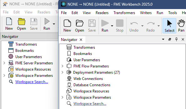


FME24 provides an overly simplified and bland user interface and experience. Even as a long time FME user I find it difficult to use and even train new users. Personally, I’m yet to find a single benefit of the change.
E.g. Simple icon colours which categorise items in the navigator (Purple = Parameters) are gone.
Similar to being able to select dark mode, I think it would be extremely helpful to enable users to select the theme and icon styles that improve their user experience.