Hello @jobvdnoort
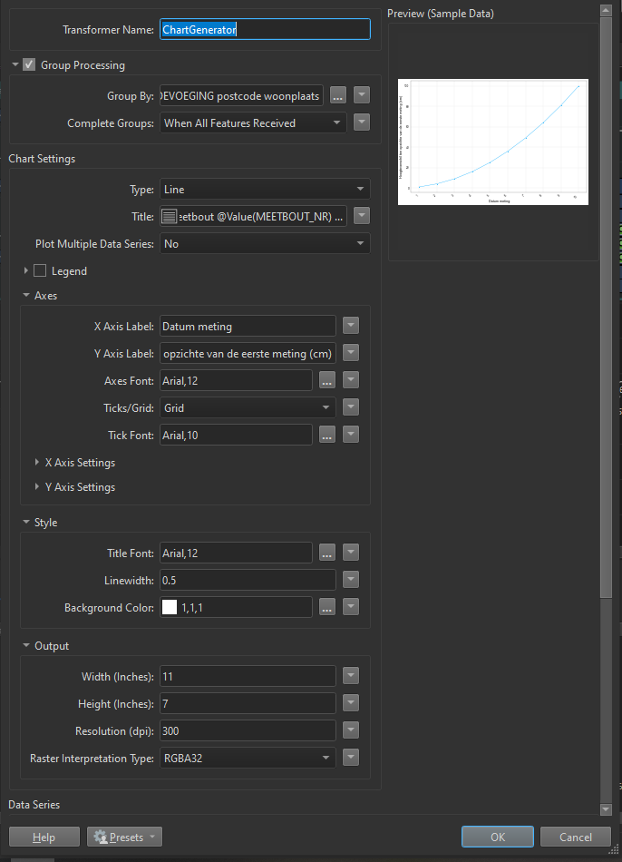
Unfortunately, the ChartGenerator doesn’t have a parameter that allows the user to specify adding data labels to the chart. I will an enhancement request to add support for this in the ChartGenerator.
There are several workarounds. FME ships the matplotlib Python library already so if you are familiar with Python, you can call matplotlib in a PythonCaller to create the charts.
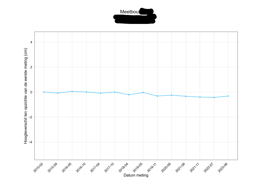
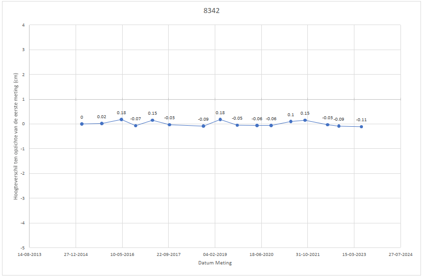
An alternative that doesn’t require Python is to generate a scatter plot chart with the same parameters as the line chart, get the position of the points by extracting the data points from the raster as vector points, create text labels from the points, and then overlay them on the line chart using a VectorOnRasterOverlayer.
I have attached an example workspace demonstrating both approaches, and I hope it helps.