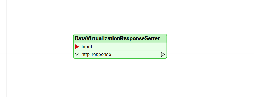
It could be that I have a little bit of OCD, but why is the transformer not exactly 3 blocks? That would be a big help with aligning things on the workspace as well.
Transformers take their width from the length of their name. We could make them snap to the grid, basically the same idea as with bookmarks, but there’s a catch: everyone can set their own grid spacing (which, I think, might be too many settings given to the user). With a really tight or super-wide grid you’d end up with transformers that look squished or stretched, which feels just as off. 🤔


 +30
+30


")