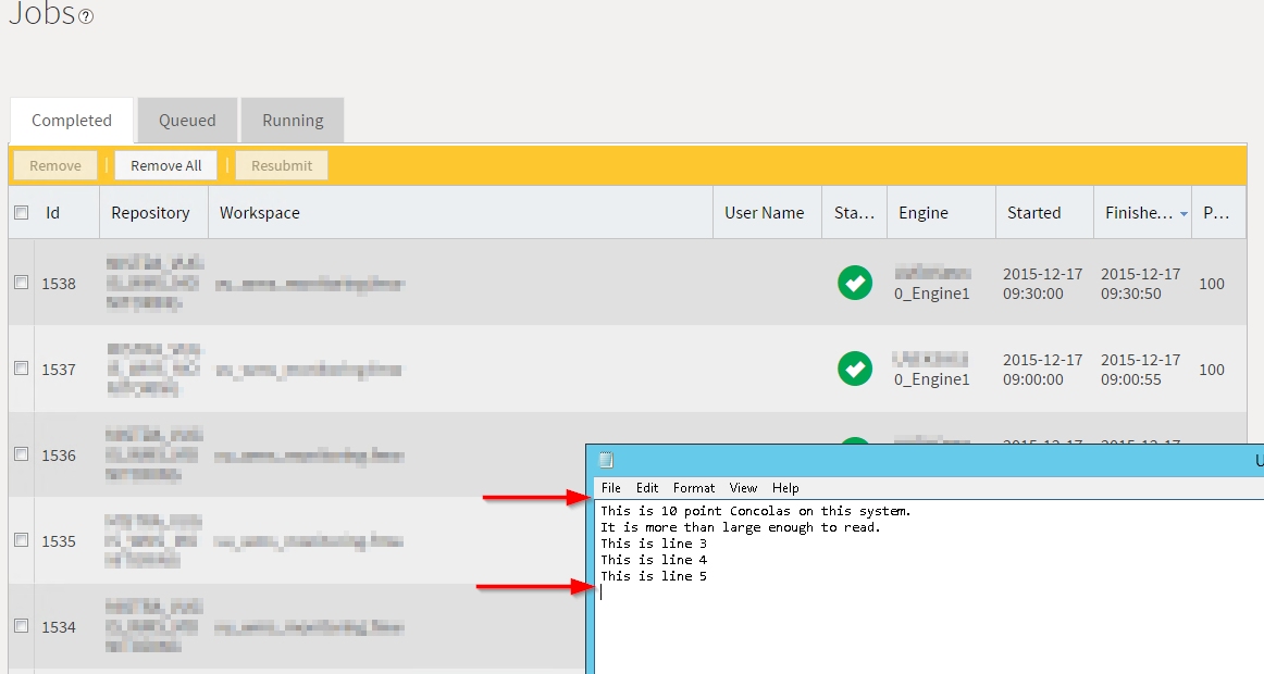



I would like the FME Server Job view to have a better design, making it more visually pleasing and more space efficient. Necessary improvements to the FME Server Jobs page would include:
- Decrease font and element sizes
- Default column sizes need re-thinking to prevent uncessesary line wraps
- Auto refresh: Button to activate/deativate automatic refresh and field to set refresh interval
- Allow filtering based on any column, including Status
Example showing how much space is lost because of default element sizing, column widths and font sizes. Regular 10 point Consolas text shown next to it for scale. In this example one single job takes the vertical space of 5 lines of regular text: