FME 2018 seems to have removed my two preferred methods of using bookmarks: 1) Without a filled background - it's too distracting to be always on; 2) No description anymore. Much neater and compact than annotation and the 2018 examples still waste too much space. Can we please have these back as an optional behaviour? I can't even edit workspaces with description anymore!

All you are encouraging me to do is to STOP using bookmarks!

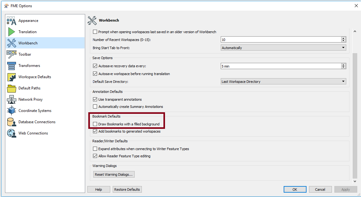
The filled background is optional in FME 2018:


You can use descriptions in bookmarks in FME2018. When you select the bookmark you'll have to use Ctrl+Enter and then you can start typing. After that the option stays available in the bookmark properties.

Also the option 'filled background' still is availble in the menu under Tools > FME Options > Workbench.

And just to mention, I would continue to use bookmarks in 2018, especially combined with Feature Caching enabled. If you collapse the bookmark, only the features being output will be cached, which saves memory and storage.


The filled background has always been optional, but we've turned it on by default for new installations in 2018 (so if you installed 2018 over an existing version it should keep the same setting). Tools > FME Options is where you can change it.

The main reason for making descriptions less obvious is that you can now attach annotation to a bookmark. With that capability we figured that descriptions were less important.


Reply