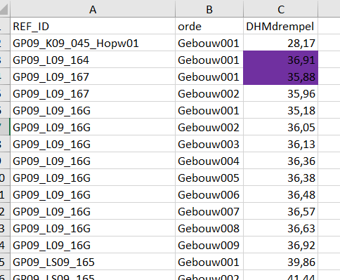
I have a dataset with 3 attributes (REF_ID, orde, DMdrempel) and one (DHMdrempel) has formatting (colouring) applied.
 There is a 1 to many relation between REF_ID and orde, a 1to1 between DHMdrempel and orde (although sometimes values of DHMdrempel can be identical).
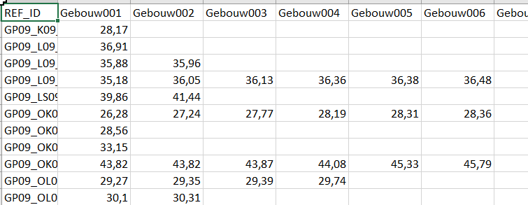
I want to create a pivottabel as this one but with the formatting applied:
 I apply an attributepivoter with parameters set as follows: group rows by REF_ID, group colums by orde and attribute to analyze is DHMdrempel.
Because of automation purposes and because I don't know the (maximal) number of 'orde'/columns, I cannot use the attributeExposer (or at least I think I can't). I therefore use a Dynamic writer to create my excel file.
But I want to include the formatting (colouring) of the DHMdrempel into my pivotted table but I can't find out how to do this.
Can you help me?


