Hi,
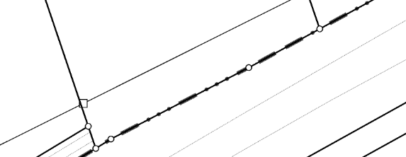
I have administrative boundaries as lines that I want to rasterize. One boundary pattern looks like this:

However, according to the type of boundary the number of dots and lines vary.
So far I have experimented with the "line pattern" symbolizer where I reference a png-file with the above pattern. The result, well, horrible:
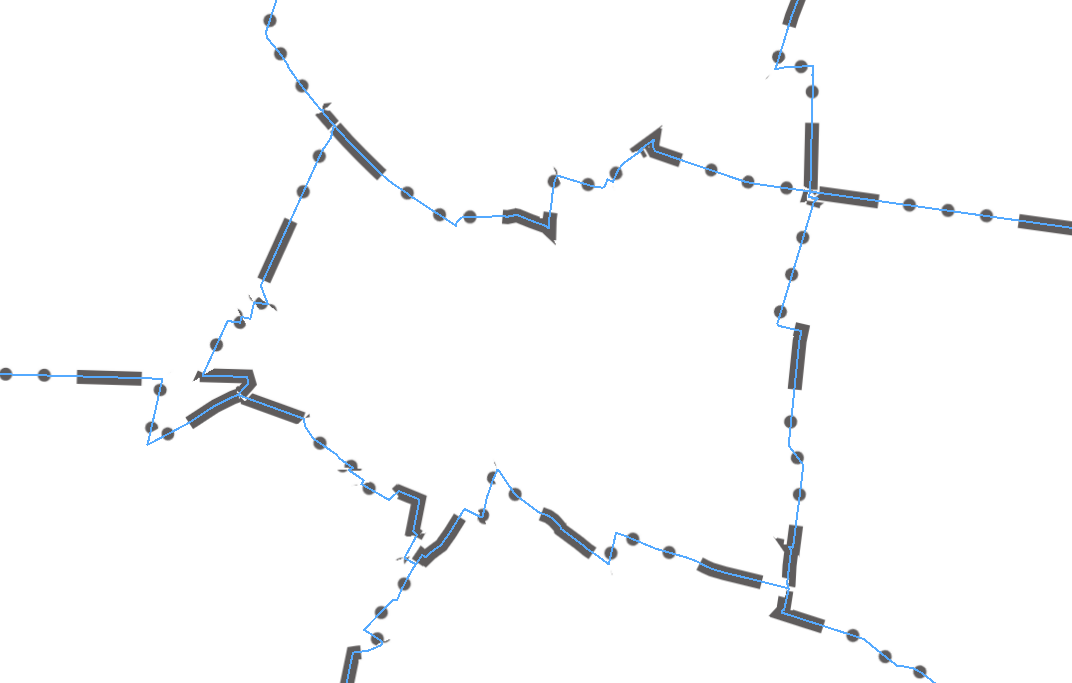
The blue line illustrates the original vector line. I would like the line pattern to be more dense and less blurred! Well, tommorow I will try the symbolizer "line", maybe I need to "stack" different styles? No clue yet.
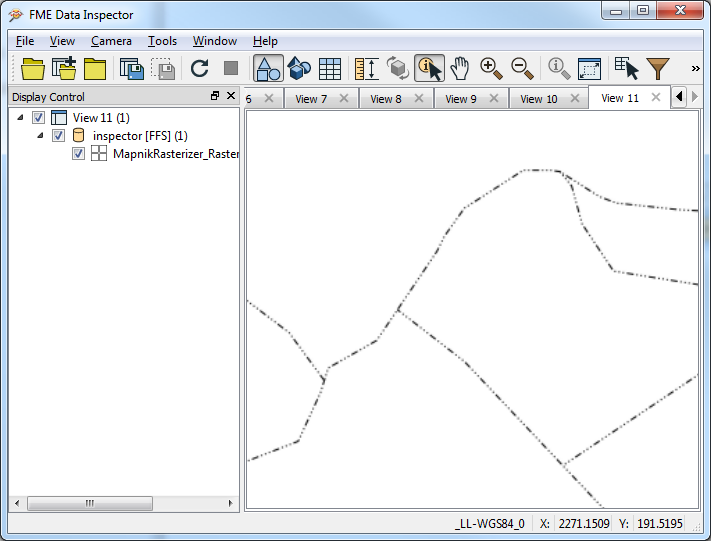
The following sceenshots shows what it should look like:
