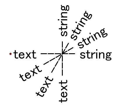
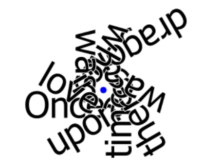
There's alignment options in the MapnikRasterizer's Text style parameters, but they take effect after the orientation has been applied and are thus useless. There's also the DX and DY parameters but I suspect those are measured in pixels and again are applied after orientation.
So far the only quick fix (and a dirty fix...) I've been able to find is offsetting your text points before putting them in the MapnikRasterizer...
Hi @redgeographics, thanks for your answer. Offsetting would be a workaround, but I'm afraid that it might be difficult to compute appropriate offset amount, since the size of text rendering area could not be calculated exactly.
Hi @gio, thanks for your answer. I found the "rotate-displacement" parameter in
the native Mapnik documentation. It seems to be fit to the requirement, but I could not figure out how to set the parameter to the MapnikRasterizer. How can you apply this parameter?
Hi @takashi,
unfortunately, rotate displacement is a Mapnik v.3 functionality, we ship Mapnik 2.2.0 with FME. We plan to upgrade to a newer version soon, but a concrete release is not determined yet.
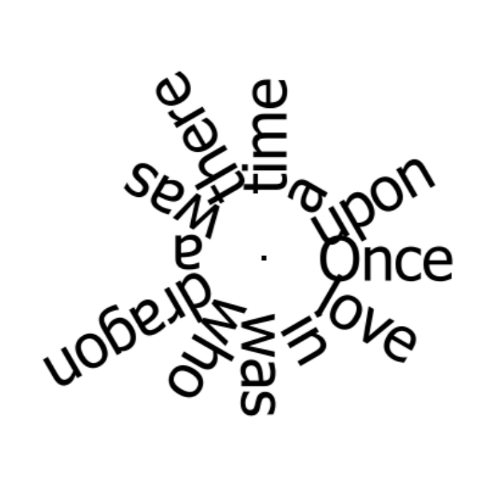
Meanwhile, I found a possible workaround - we can pad the labels with spaces on the left - as many as there are characters plus 2-4 more for an offset. Here is how the output looks like (a single point and twelve labels for it):
The trick here is the space in StringPadder - simple space, which (invisibly) appears after pressing the space button, does not work, so we have to use one of the other spaces such as no-break space or soft-hyphen.
The standard Windows Character Map (I assume, other platforms should have similar apps), or this page - http://alumnus.caltech.edu/~leif/namedchar.html offer a few spaces of different types and lengths.
I suspect, this might not work with all fonts, but for now, I think, it might work as a temporary solution.
The wokspace is attached: mapnik.fmw
Dmitri
Hi @dmitribagh, thanks for the tip. This can be very helpful when the possible vertical alignment was limited to Middle. However, every alignment should be possible in the actual requirement and this method seems not to be applicable to Top and Bottom alignments.I finally found a workaround today.
- Once render the text with a specific alignment (e.g. Middle-Middle) and no rotation.
- Create the Data MRB Extents area from the raster.
- Offset the area depending on the required alignment.
- Rotate the area around the original placement point.
- Replace the area with its center point.
- Render the text at the center point, with Middle-Middle alignment and the specified orientation angle.
Workspace (FME 2016.1.3):
mapnik-rotate-displacement.fmw
Result - Alignment: Left-Bottom
It's dirty and also inefficient, but sufficient to my project.
I accept @redgeographics's answer, since my workaround has been inspired from their suggestion - offsetting. Thanks everyone!