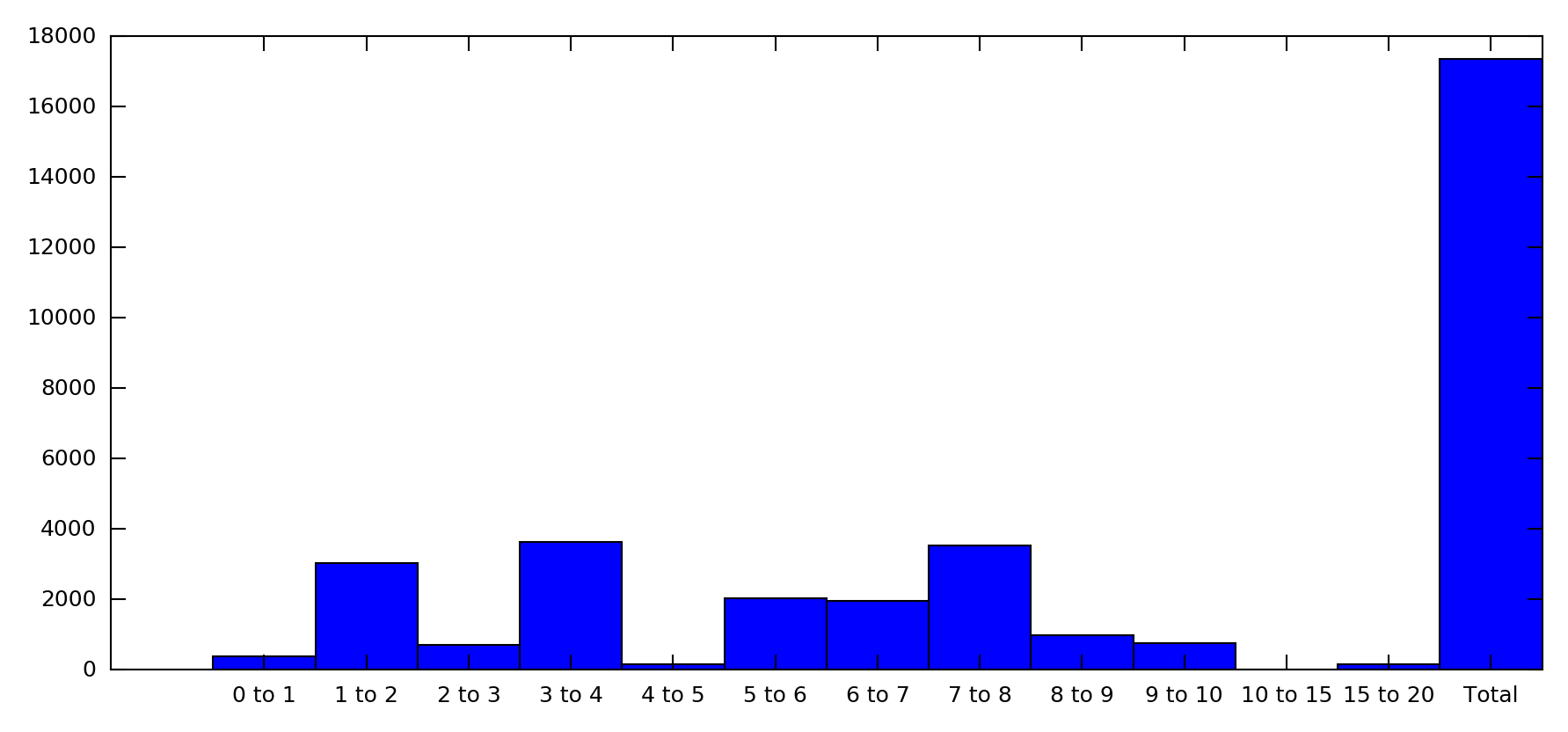
Pl. see data in attached Excel file. I am able to obtain the data ready to plot histogram as shown in the attached Excel file. The further steps to plot histogram is where I am stuck.

Question
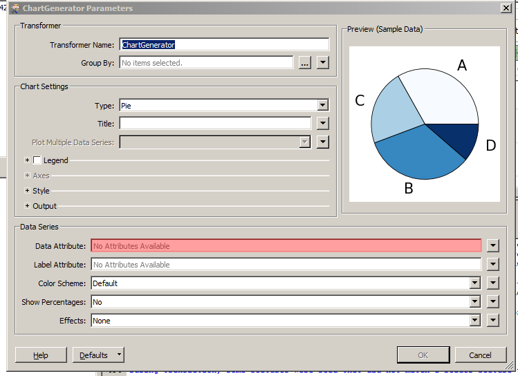
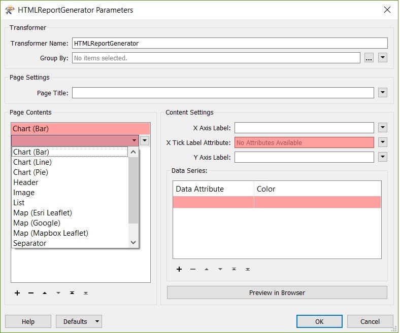
how to generate histogram
This post is closed to further activity.
It may be an old question, an answered question, an implemented idea, or a notification-only post.
Please check post dates before relying on any information in a question or answer.
For follow-up or related questions, please post a new question or idea.
If there is a genuine update to be made, please contact us and request that the post is reopened.