
FME UI Changes for 2025.2

  • December 12, 2025
  • 8 replies
  • 163 views
TandraAtSafe
Safer
Forum|alt.badge.img+8

There have been some exciting updates to the user interface in FME 2025.2 for both FME Form and FME Flow. Functionally, the software remains the same, but these changes were introduced to improve clarity for users. 


FME Form Changes

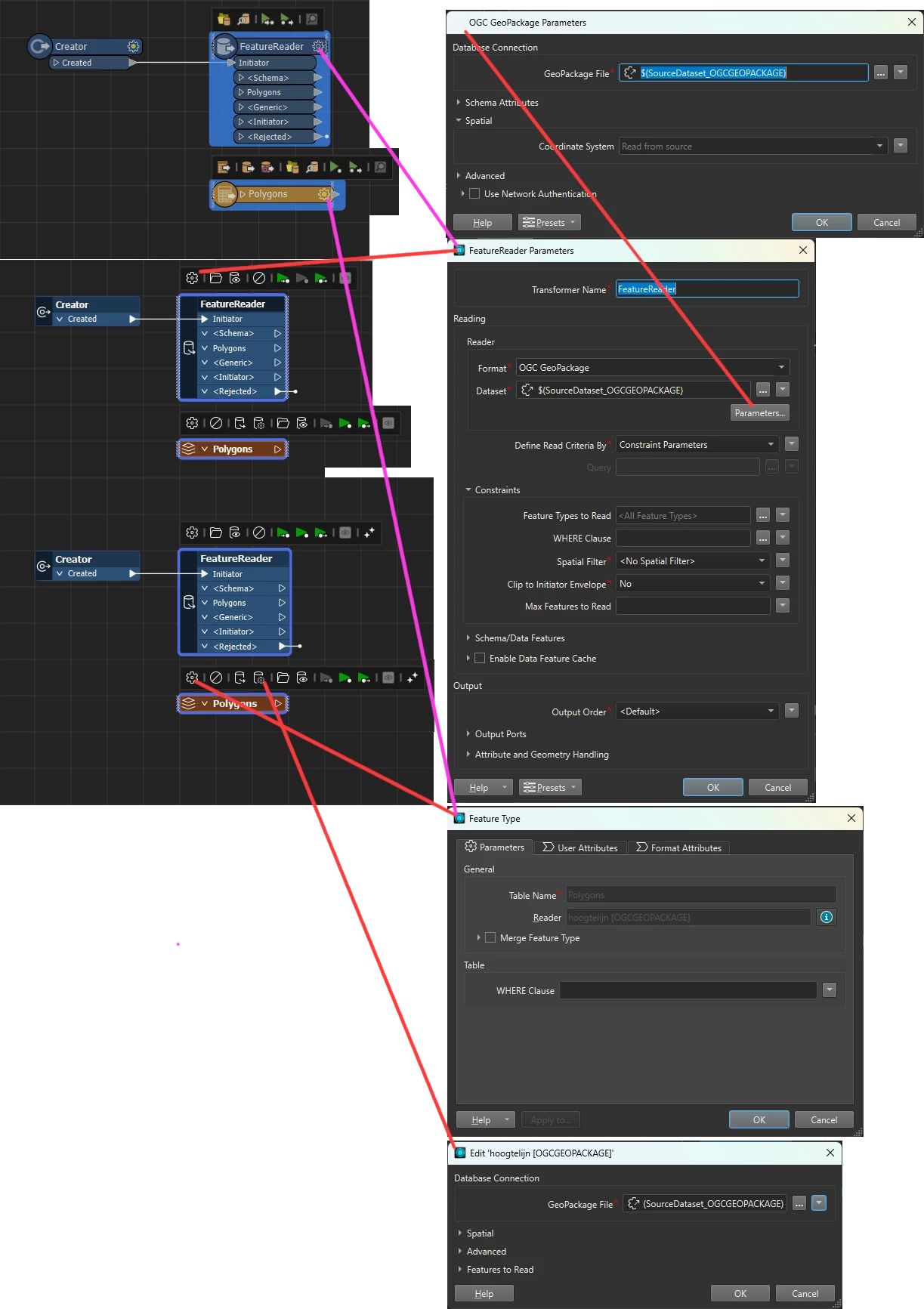
Coordinate System Parameter: This has been moved to the Parameters window. This parameter isn’t important for users who do not work with spatial data, and we wanted to reduce confusion in readers and writers. See Coordinate System Parameter Location Change for more details.


Parameter fields: These have been updated to show a red box around the field instead of highlighting the whole field red. This feels less visually aggressive while still signaling that an action needs to be taken. The field only appears red after invalid input.


Additionally, required fields now have a small asterisk to indicate they are required.


Workbench Window Name Updates: We want users to understand the purpose of each panel without needing prior knowledge of FME’s internal language. 

Current

2025.2+

History

Edit History

Feature Inspector

Breakpoint Inspector

Feature Information

Record Information

Visual Preview

Data Preview


Input Optional Transformers: For select transformers, the creator transformer is no longer required as an input. The need for a creator transformer was confusing for new users as it often served little purpose. For more information on which transformers this applies to, please see Transformers with an Optional Input.


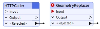
When no input is valid for a transformer, the input triangle appears as a black line. When input is required, the triangle is red. 


Spatial and Non-spatial Readers and Writers Combined: To reduce the number of readers and writers, we have combined some of the spatial and non-spatial ones into one item. This will reduce confusion for users and the need to keep multiple readers and writers updated. For more information on which readers and writers this applies to, please see Combined Spatial and Non-Spatial Readers and Writers


Workspaces authored in previous versions will continue to function, but moving forward, using the combined reader/writer will be required.


FME Flow Changes

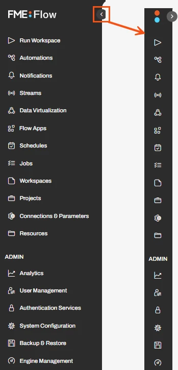
The navigation changes in FME Flow have been made so users can easily see the options for each action in the menu. This will reduce the number of page loads required to perform tasks and organize related actions together. 


The menu has been updated to show only the top-level items, such as Run Workspace and Automations. Users must click on the headings to access additional functionality within those. 

This helps users easily find the page they are looking for without having to open multiple headings. Depending on your screen size and resolution, users may have to scroll down to see all the options.


The sidebar can be minimized, allowing more space for working in Flow. When the sidebar is collapsed, the page names disappear, but small icons appear. 


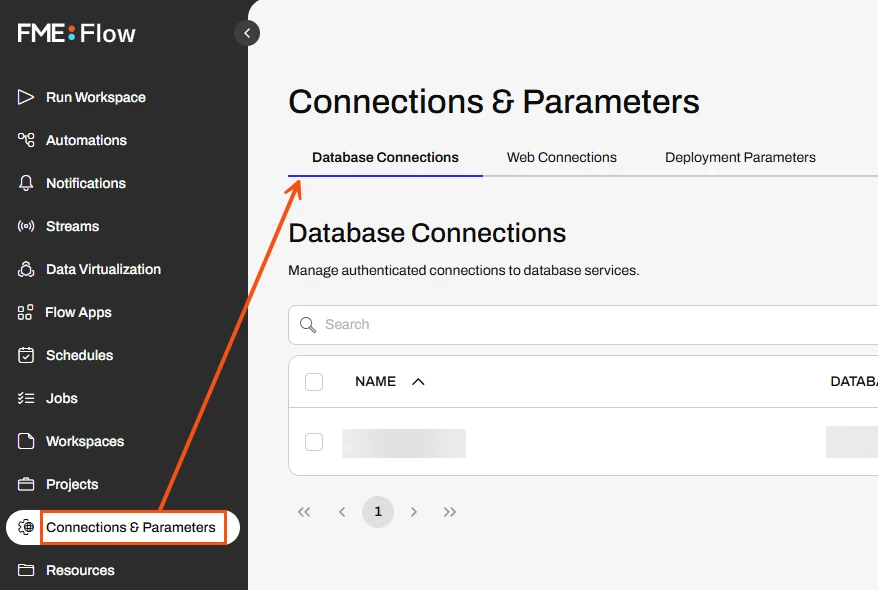
Previously, users could access items such as the database and web connections from the menu bar, but as part of the reorganization, these have been moved to the Connections & Parameters page. 


The Dashboards tab is visible on the Jobs Page: Accessing dashboards can now be done from the Jobs page instead of the menu.


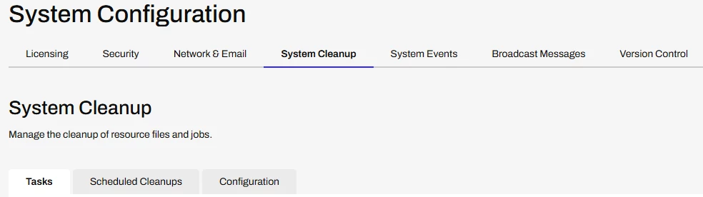
The System Configuration tab has been implemented. Users with admin or system-level configuration in FME flow can use tabbed navigation to perform system tasks. The new organization is clearer and requires fewer page loads when switching between tasks.


8 replies

jkr_wrk
Influencer
Forum|alt.badge.img+36
  • December 15, 2025

Nice article.

Enhancement Idea:

Could you change the color of Creators and FeatureReaders that don’t require Creators to the same color as readers? It would enhance the workflow a lot knowing where processes start. Most of my workbenches start from a single creator so it currently isn’t a big of a deal. But if I need to look through a giant workbench to see all locations where processes could start it could be hard.

Coloring FeatureWriters (different) could also help but I think it’s difficult to predict every transformer that changes data. Like SQLExecutor, HTTPCaller, PythonCaller etc. that can either be a process starter as a data changer.

Also:

This change renders the SQLCreator and the PythonCreator obsolete?


s.jager
Influencer
Forum|alt.badge.img+23
  • Influencer
  • December 15, 2025

When does the little cog come back on transformers/readers/writers? Now when working on something I have to use twice as many mouse-clicks when editing/tweaking stuff: once on the transformer to get the little popup, and once again to get to the parameter window. That used to be a single click...

Not really my idea of an improvement in UI/workflow...


jkr_wrk
Influencer
Forum|alt.badge.img+36
  • December 15, 2025

Did you know you could use FeatureReaders and FeatureWriters. They are way more intuitive.

And yes, this also requires to open two popups, but I got way more confused with the old readers opening a popup and only having half of the settings and then looking for a little cog that I did not understand.


s.jager
Influencer
Forum|alt.badge.img+23
  • Influencer
  • December 15, 2025

Did you know you could use FeatureReaders and FeatureWriters. They are way more intuitive.

Yeah, I know I can use those, and no, I do not find them more intuitive - on the contrary, to me they are counterintuitive. And they do not obey the Redirect-toggle, which to me is a huge nono, so I only use FeatureWriters when I absolutely have to (FK constraints), otherwise I avoid them. Have never used FeatureReaders...


jkr_wrk
Influencer
Forum|alt.badge.img+36
  • December 15, 2025

I thought that the ‘Database with COG’-icon was hard to find. But you mean the regular COG icon on the old Transformers. I always double-click on the Transformers, so never missed the COG, personally.

The Database-with-Cog is missing from the FeatureReader so you have to open the transformer and then press Parameters… to get to the same settings, but I like this pattern more than the different icon approach on normal Readers.


Also notice the order of the icons on the Reader vs. FeatureReader:
Open File Location, View Source Data, Disable Transformer (File)
vs.
Disable FeatureType, Disable File, Parameters, Open File Location, View Source Data

The Disable icon on the FeatureReader is added after version 2021 but at a different location then the Reader.


So there is still a lot of inconsistency between both windows. Some settings like unexposing specific user attributes, (which are feature attributes?) are not available on FeatureReaders. While others are only available on FeatureReaders. And location of specific settings are different as well.


jkr_wrk
Influencer
Forum|alt.badge.img+36
  • December 15, 2025

Well, because there are way more transformers that could modify data, I never trusted the Redirect-Toggle and build my own Redirect-Toggle if needed.

And I did not know people could live without FeatureReaders. My workbenches are full of FeatureReaders half-way trough the flow, only Reading if necessary.


s.jager
Influencer
Forum|alt.badge.img+23
  • Influencer
  • December 15, 2025

you mean the regular COG icon on the old Transformers

Yup. Everything had one of those, Readers, Writers, Transformers… nice and consistent, and a single click would open the parameters for that object. That’s now gone, so either it is a double-click, or a single click, which then gives a very tiny popup above the object (obscuring any annotations you might have added), which has the little cog-wheel. So however I approach it, it adds a mouse-click for me. 

Maybe I’m just ranting, but at the moment I’m not very pleased with FME because it’s causing me a lot of unnecessary work - apologies if I’m coming across as a bit cross… (pun intended ;-) )


jkr_wrk
Influencer
Forum|alt.badge.img+36
  • December 16, 2025

Well, they invest a lot in workbenches doing the work faster. And stepped on the AI boat to try to built faster.

But indeed most users would like to be able to built faster. And a single or double click isn't going to make a judge difference, but your rant should be an invitation to speed up the built process.


Not having to add a creator is a good step forward.