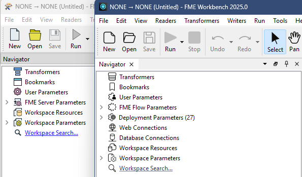
FME24 provides an overly simplified and bland user interface and experience. Even as a long time FME user I find it difficult to use and even train new users. Personally, I’m yet to find a single benefit of the change.

E.g. Simple icon colours which categorise items in the navigator (Purple = Parameters) are gone.

Similar to being able to select dark mode, I think it would be extremely helpful to enable users to select the theme and icon styles that improve their user experience.

 

Updated idea statusNewArchived
Idea merged into:

All the votes from this idea have been transferred.

ArchivedOpen

This idea has been reopened based on feedback in this community post


A few additional comments:

  • It seems like themes were available a while ago (prior to 2017).
  • When connection styles added changed, users were offered a choice rather than forcing them to use one option. Providing users with a theme choice would be handy.
  • FME25’s colour addition is extremely limited and still doesn’t easily differentiate between navigator icons (only the nested level).
  • Custom themes which could be shared in the community (FME Hub) might be an interesting feature.

As an addendum to this question, was wondering what consideration is given in GUI design here for accessibility? 


The following idea has been merged into this idea:

All the votes have been transferred into this idea.

The following idea has been merged into this idea:

All the votes have been transferred into this idea.

The new design is really bad for easy and quick navigation. Every button and icon looks the same, and the fact that they are black and white, with thin lines, makes them blend together with text too.


The following idea has been merged into this idea:

All the votes have been transferred into this idea.

@martin_fme_user Definitely worth adding your transformer specific comments into this thread. What you’ve pointed out just adds to the need for at least giving users a choice.


The new design is really bad for easy and quick navigation. Every button and icon looks the same, and the fact that they are black and white, with thin lines, makes them blend together with text too.


I absoloutely agree. Colored Icons are supposed to quicken the selection. With thin black Icons I still have to read the text which slows the work flow in general. Please add Colors again or even bether add a choice of a general style (fme 2023 / 2024 / etc.).


I am a convert to the new style except for the Navigator window, it needs the colours back, same for the ribbon.