Hello,
I adore working in dark mode on all software I use (ADOBE suite, Visual Studio, Office, etc)
I use FME very often and I was really excited once I heard about the new dark mode. However, after testing it in the beta version, it seems that it still need some more ameliorations to become perfect.
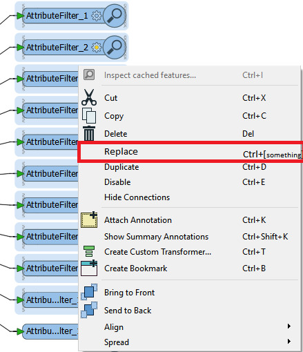
1.The toolbar needs a new redesigned set of icons. A new entirely grey set, designed only for the dark mode will be really beautifull ;
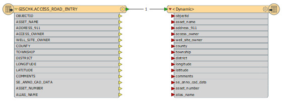
2.The blue color of transformers doesn't really go with the dark theme. It would be nice to allow the user to change it to some shade of grey maybe ;
3.It will be appreciated to allow the user to make the toolbar with a darker shade of grey than the workbench transformers space ;
4. It will also be very appreciated to change the default title bar included with windows to some new one redesigned especially for FME
5. if it has to be dark, it has to be dark for the whole interface :
6. This selection effect isn't reealy esthetic. Better can be made
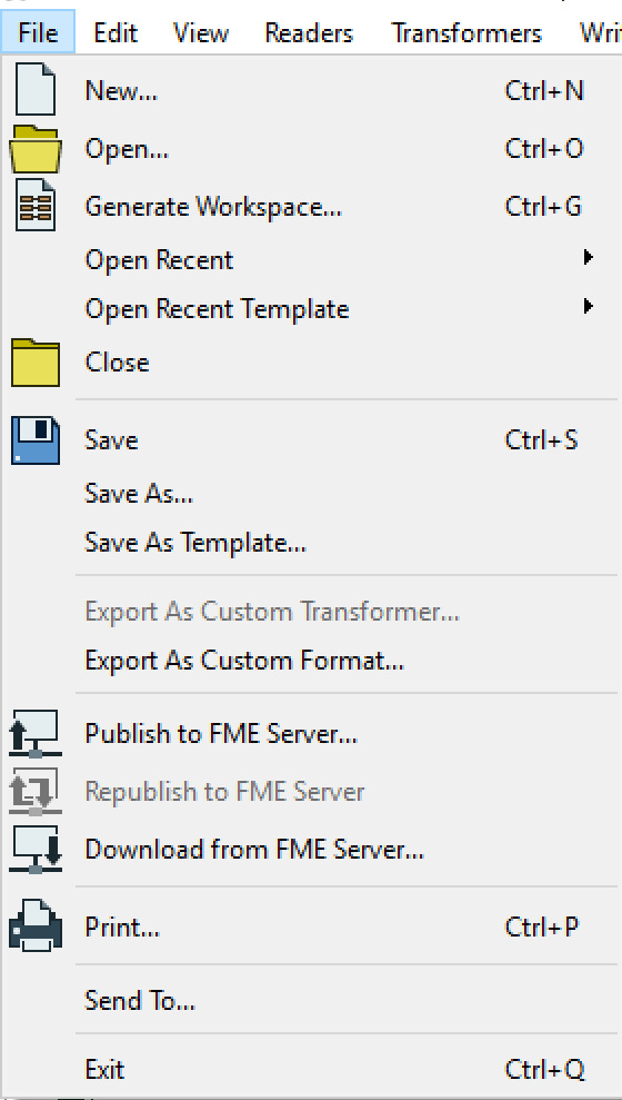
Please find below some pictures which may help in ameliorating the dark mode : 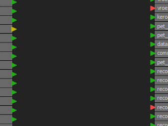

Best regards.