Question

PowerPointStyler Stacked Column Chart

  • April 29, 2020
  • 1 reply
  • 18 views

Forum|alt.badge.img+4

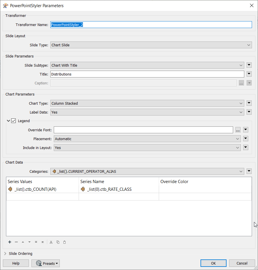
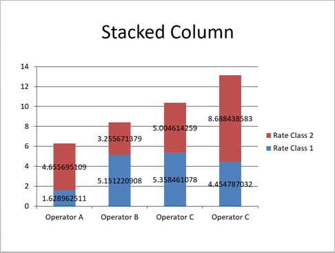
How do I set up my data to generate a stacked bar chart? For each CURRENT_OPERATOR_ALIAS category, I have 7 bins (RATE_CLASS) that I'd like to chart, where one bar is a CURRENT_OPERATOR_ALIAS with corresponding counts (COUNT(API) attribute), but I can't seem to plot 2 categories in the PowerPointStyler.


1 reply

debbiatsafe
Safer
Forum|alt.badge.img+20

Hi @dmatranga

You will need to create each rate class (bins) as a list attribute and add each list attribute as a series in order to create a stacked column for each category (operator). I have attached a very simple example which creates a stacked column chart as shown in the screenshot below createstackedcolumnchart.fmw

You may need to modify the structure of your list attribute to achieve this. If you're able to attach a small sample of your data and your workspace, it would be helpful in identifying what needs to be changed.


Reply


Cookie policy

We use cookies to enhance and personalize your experience. If you accept you agree to our full cookie policy. Learn more about our cookies.

 
Cookie settings