
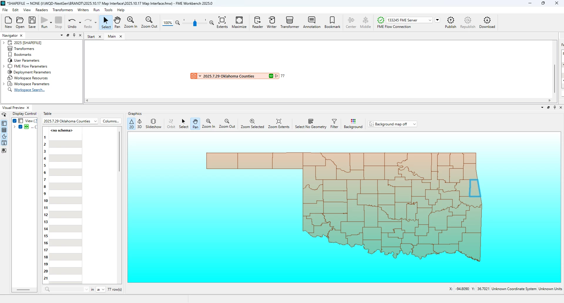
I am looking for guidance on how to create this interactive map..  We have FME and ArcGIS… 


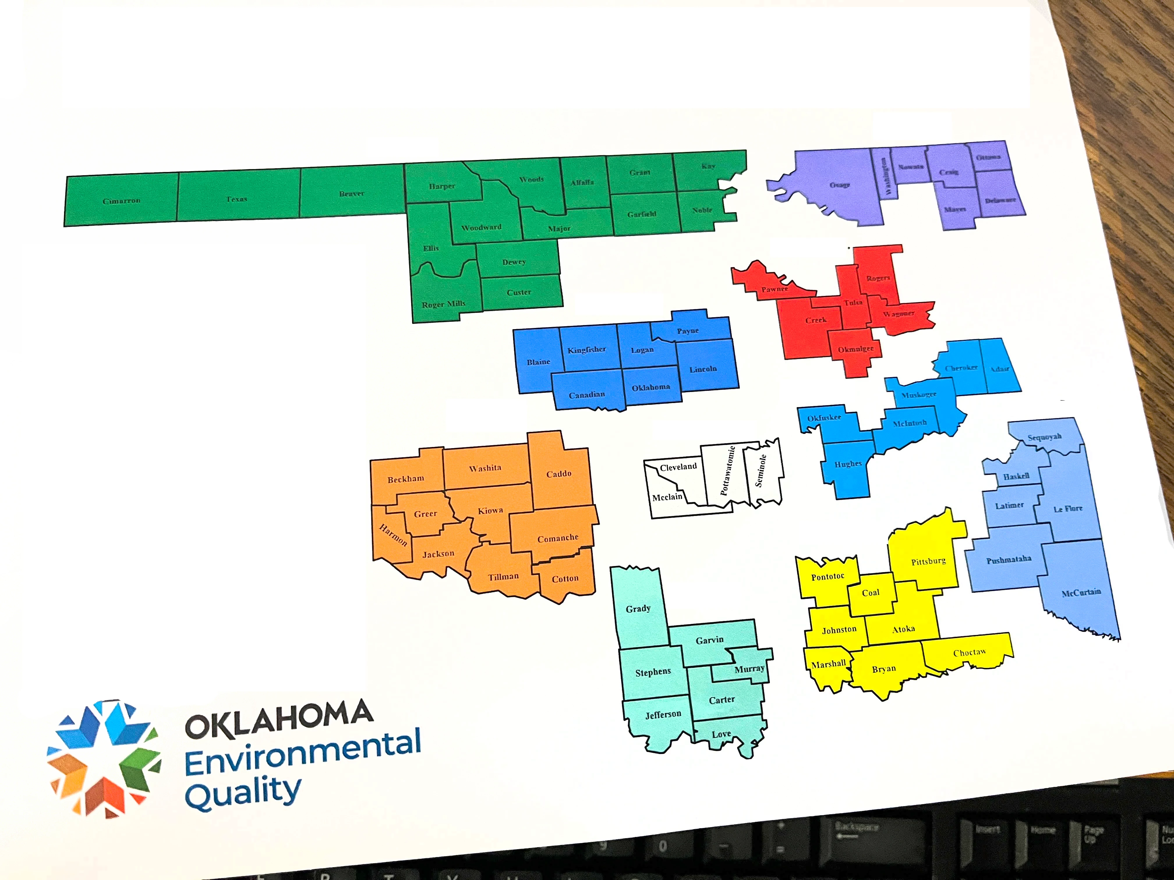
From time to time, we are given maps and we have to change the counties based on new staff.  Most of the time the counties are adjacent.  Other times not.  We have a shapefile of the counties. 

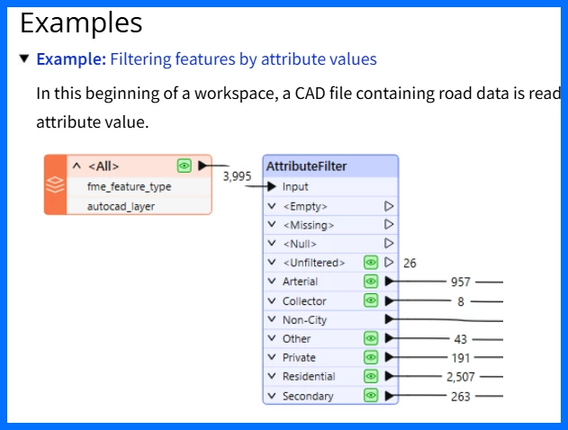
I am looking for a solution where we can select the counties in the shape file/FME and output the selection for the update query.

I believe I have all the pieces Just not sure how to attach the transformers together… or what the logic is to create this…


TIA (Thank you in advance)


Hi ​@shawn.brandt 

I am trying to wrap my head around what will be the output. Looking at the visual:
1. Counties are grouped on an attribute (color)
2. The groups separated to create a better visual. This does not represent the geographic relationship (there are no huge white gaps in the Great State of Oklahoma 😂)

Question: To make the visual, are separate shapefiles created from the selected counties and then the visual is created by somehow taking the individual groups of counties and separating them (dragging them apart in a mapping program)? Or do you use multiple maps in a Layout? One for each collection of counties/shapefile to create the visual separation? 


crutledge

Thank you for responding… so let me see if I can fill in a little more information…

We have a shape file with that includes the boundaries of each county...


And what I am trying to achieve is selecting multiple counties in FME, as shown on the map in my original post, and getting final output like this 


‘MCCLAIN’, ‘CLEVELAND’, ‘POTTAWATOMIE’, ‘SEMINOLE’


These are the 4 counties in white…  Does that make a little more sense in what I am asking for assistance in?


Thank you for responding.


Hi ​@shawn.brandt 

I think I follow you. If I understand you correctly you have read in a shapefile  and see the geometry in the Visual Preview. At this point you wish to select polygons in the Visual Preview and then “export” or work with that selection. If so, FME doesn’t quite work that way. If you are used to using Esri products, think of it a bit like Model Builder. In FME you set up a number of “steps” using Readers (like you have here with your shapefile) and Transformers (you will add them to “do something” with the data) and Writers (export your data into a new format or subset).

I hope that makes sense. There are many options available to you to “break out” or “subset” your country file. But it would need to be in the data table. Like, for each of the groups of counties they have a color. Is that in the table? You could use something called an AttributeFilter to seperate your data.


You could also use a technique called About Fanout


I would also suggest taking a look at the following tutorial that hits on a number of FME fundamentals. Tutorial: Getting Started with FME Desktop – FME Support Center

I do hope that helps and good luck!