
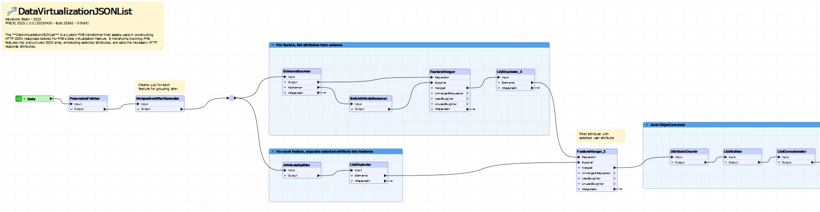
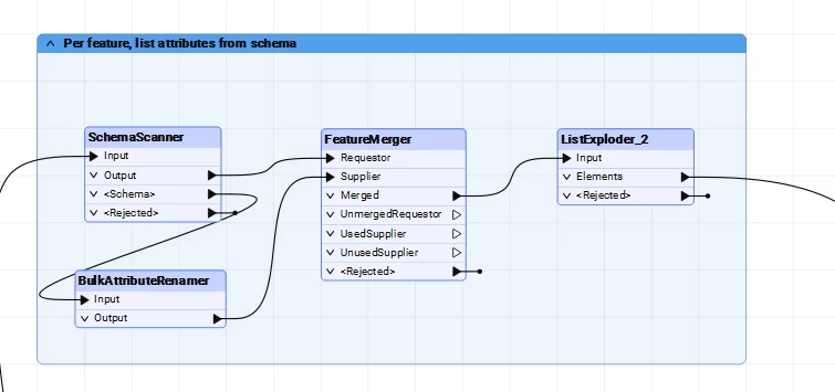
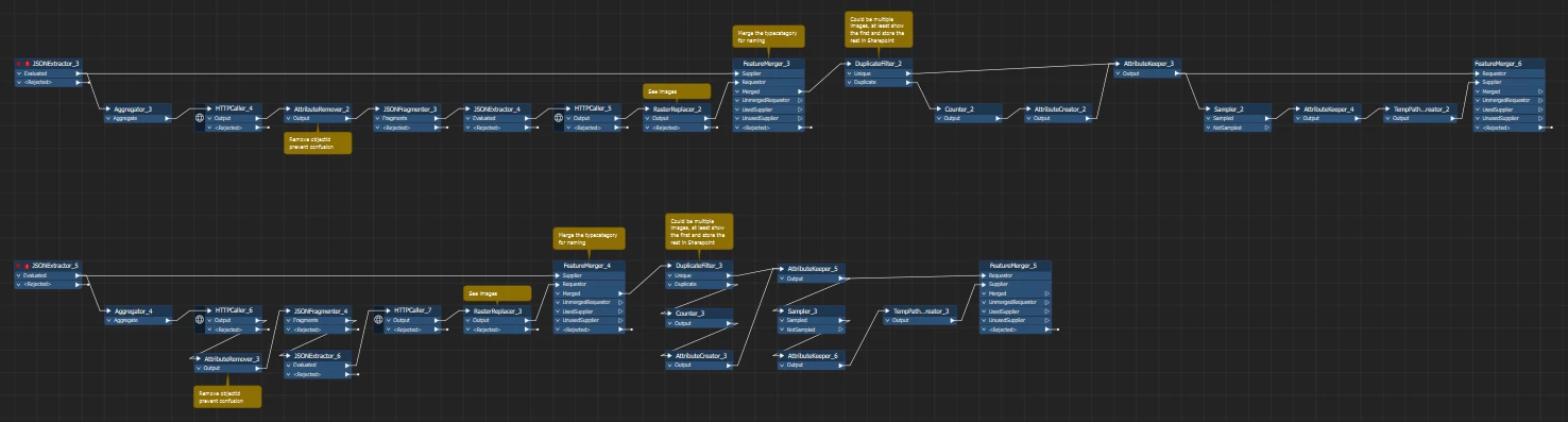
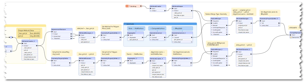
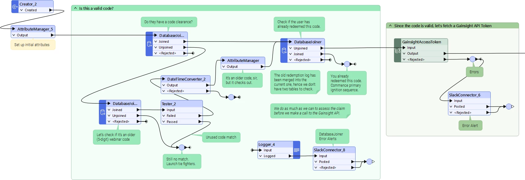
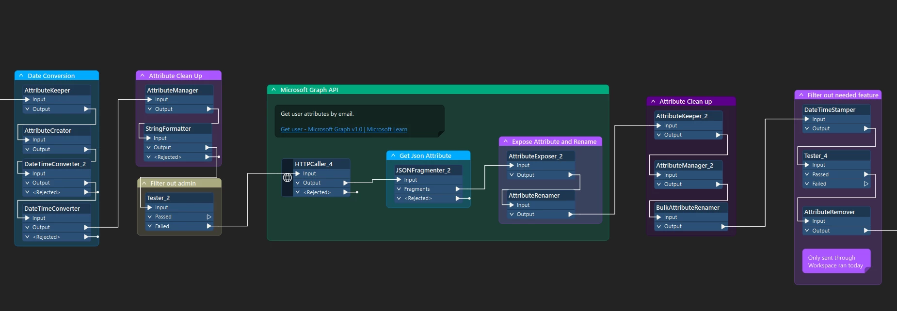
Yesterday, after completing a first draft workspace, I showed my canvas to a colleague and they commented on how bizarre 🤢 my transformers appeared.

I’d been painstakingly aligning my transformers by port - so that the output of a transformer would lead directly into the input of the following transformer. This creates flat, linear connections … but the transformers themselves don’t necessarily align. 

What’s your preference?  Check out your options here:  Arranging Objects on the Canvas

I prefer a 150x150 grid, snapping transformers on top left corner. Straight connections and fixed width transformers, truncates transformer names on right. No transformer renaming, annotations above transformers to explain the why, not the what. Bookmarks to annotate subprocesses. Dark mode, Safe Software (minimal) palette, dark yellow annotations.

I’m pretty sure being busy with the arrangement of transformers helps me with structuring solutions for my challenges.


Basically Left and Top, but sometimes apply Right to Creator transformers and reader feature types - i.e. objects have no input ports.


My overall preference is to align the tops of transformers, but I break that rule often to ensure connections don't overlap eachother or transformers.

I guess my answer would be “it depends”, which is my standard answer for a lot of things actually.


A picture might worth a thousand words


I would avoid anything like this
 

I find it hard to read on larger workspaces.
 

Grid is mandatory for me, in any node-based programming software. I would love to be able to disable the relative-to-any-other-element snapping options in FME.


Depends on the situation. I would prefer the lower setup. The global flow is from featuremerger to featuremerger and the transformers on the sub-track I can oversee when looking at the main track.

But main tracks are easier to read from left to right.
 

I try to keep the main track in one row. Every transformer alligned top.

Sometimes stack two bookmarks on top of each other every bookmark contain Transformers aligned top.


For your reference, other than the policy on objects alignment, personaly I have these rules about organization of workspaces.

  • Do not change the order of input/output ports, except user addable ports - e.g. TestFilter, GeometryFilter, AttributeFilter, etc.
  • Avoid crossing of connection lines as much as possible, but there are cases where crossing is unavoidable. Crossing is better than changing the order of ports.
  • Do not change transformer names, but allow to add an appropriate suffix.
  • Do not insert vertex on connection lines. In a case where a connecion line should be bended, insert a Junction instead.
  • Usually add prefix '_' (sometimes '__' : double underscores) to attribute names which are defined and consumed within the workflow, in order to distinguish from attribute names in source/destination datasets.
Workflow Example


I’m generally a “line up the ports” kind of author, too. Obviously, you do more than that, otherwise you end up with an extremely long, snake-like, workspace. But I like my connection lines to be straight, where possible.


I would love to be able to disable the relative-to-any-other-element snapping options in FME.


Press the control key when you move items and it turns off the neightbour alignment bars (or whatever they are called!)


Not regarding to organization of workspaces, I would add this important one to my personal rules about workspace design.

  • Never set "Continue Translate" to the Rejected Feature Handling parameter. You could overlook critical issues to be resolved, if you have set the option. If you are sure that rejection on specific transformer(s) is definitely allowable, connect a transformer - e.g. Junction or Logger to their <Rejected> port(s), instead of setting the option.

Reply