Hello FME friends,
If you remember, the 12 Days of FME contest for 2024 has a special prize for data visualization. The idea is to download some of the data from the contest and (preferably using FME) analyze it and visualize it. The best visualization wins a US$100 gift card!
It just occurred to us that you don’t even need to have launched a balloon! You can do a visualization anyway! This part of the contest is open to anyone.
So, this thread is where I suggest you post your visualization entries. It might be a simple image, a link to an online map, a video animation, or…. anything you can think of.
Here are some ideas I came up with. Feel free to use any of these, or create your own:
- Did any balloons crash into each other? I didn't test for that. If not, what was the smallest distance between two balloons? Assume that a balloon is 20m in diameter and 30m in height.
- Can you visualize who did the best airport avoidance? i.e. who would have crossed over an airport, if they had not made a command to change direction?
- Can you calculate who did the most efficient route? i.e. distance travelled vs straight line distance between the start and end points. Beware the dreaded 180 meridian!
- Can you visualize the data over time? For example, to show a route in an animated fashion?
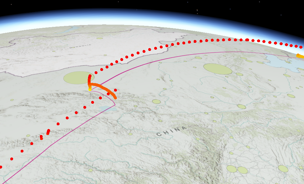
- Can you create any interesting maps from the balloon data? Maybe a heat map of balloon tracks? A map of the most crossed countries?
- Can you map the balloons of the top half of the leaderboard in comparison to the bottom half? Did launch location affect the results? Were some balloons doomed to lose as soon as they took off?
- How about a graph of team registrations? Total and per day? All of this information is available if you mine the data downloads closely enough.
Also, check out this week’s Question of the Week. I believe there may be some more ideas there.
Thanks for taking part. We’re really looking forward to seeing what you can come up with!
Regards
Mark