Hello FME friends,

If you remember, the 12 Days of FME contest for 2024 has a special prize for data visualization. The idea is to download some of the data from the contest and (preferably using FME) analyze it and visualize it. The best visualization wins a US$100 gift card!

It just occurred to us that you don’t even need to have launched a balloon! You can do a visualization anyway! This part of the contest is open to anyone.

So, this thread is where I suggest you post your visualization entries. It might be a simple image, a link to an online map, a video animation, or…. anything you can think of.

Here are some ideas I came up with. Feel free to use any of these, or create your own:

  • Did any balloons crash into each other? I didn't test for that. If not, what was the smallest distance between two balloons? Assume that a balloon is 20m in diameter and 30m in height.
  • Can you visualize who did the best airport avoidance? i.e. who would have crossed over an airport, if they had not made a command to change direction?
  • Can you calculate who did the most efficient route? i.e. distance travelled vs straight line distance between the start and end points. Beware the dreaded 180 meridian!
  • Can you visualize the data over time? For example, to show a route in an animated fashion?
  • Can you create any interesting maps from the balloon data? Maybe a heat map of balloon tracks? A map of the most crossed countries?
  • Can you map the balloons of the top half of the leaderboard in comparison to the bottom half? Did launch location affect the results? Were some balloons doomed to lose as soon as they took off?
  • How about a graph of team registrations? Total and per day? All of this information is available if you mine the data downloads closely enough.

Also, check out this week’s Question of the Week. I believe there may be some more ideas there.

Thanks for taking part. We’re really looking forward to seeing what you can come up with! 

Regards

Mark

@barry the 3d shows the FME  magic ✨ in 3D visualization.


@hansh the airport avoidance map is great 👍


Hello Users.

I used FME Form and Flow to create my Augmented Reality map, visualizing the countries that my Solutial balloon passed through.

Here we can see the App created in the FME Flow App. Initially, the user chooses the balloon to be analyzed and executes it in Run.

The App returns the fmear file (Augmented Reality).

The Workspace created in the FME Form did the spatial relationship between the balloon's registered points with polygons of countries and stores this information in the Points Collected attribute.

Countries that have points collected from the balloon are yellowed.


@danilo_fme The augmented reality you develop is really good and the visualisation is mobile friendly showing responsiveness.


It is indeed theoretically possible that the top ones on this list also hit the most airports...


It is true. My Team Rocket tried to hit as many airports as possible (and managed to do so, with 33 hits), but according to your list I also avoided the most. I guess that if your analysis checks which teams made course corrections close to airports, my corrections were indeed made to HIT the airports and not avoid them. :-)

Interesting twist! :-)

Then the statistics I put forward should for you be showing the times you course corrected but did not manage to hit the airport in question. Does that seem correct?


Interesting twist! :-)

Then the statistics I put forward should for you be showing the times you course corrected but did not manage to hit the airport in question. Does that seem correct?


It might, but 67 times seems very much.


jonas_nelson my Team Evoteck really tried to avoid hitting the Airport by checking the Airport layer on the map, and  also knowing the possible route to direct my balloon.


jonas_nelson my Team Evoteck really tried to avoid hitting the Airport by checking the Airport layer on the map, and  also knowing the possible route to direct my balloon.

Interesting, your team doesn’t appear on HansH’s list, even if you really tried to avoid airports? Maybe you didn’t get close enough for the avoidance to count?


@jonas_nelson Yes my Team doesn’t appear on HansH’s list, because my balloon track did not get close any Airport.


Hi everyone,

For the 12 Days of FME Contest, GeaMetrics (Team ID 257) created a dynamic 3D dashboard showcasing balloon paths around the globe. The visualization includes:

  • Historical trajectories segmented by time intervals.
  • Filters to explore data by team and analyze key metrics such as timing and distances.
  • A time slider to navigate routes from the start to the end of the contest.

The data was processed using FME, and the dashboard is built in ArcGIS Online.

Check it out here: https://www.arcgis.com/apps/dashboards/2308197caa5946ff9ec30056e507dd8c

Happy mapping! 🎉

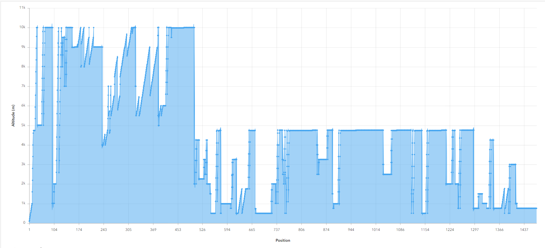
This is a great app! Nicely done. I wonder if there is an exaggeration factor or calculation that can be used on the real altitude to better exaggerate/visualize big changes in altitude and visualize them on a global scale? Like a power function or something. I like seeing the altitude changes like in our attitude graph.


Mark, are you planning to release the workspaces from this contest? I’d love to see how you did this.


@crutledge I just checked the dashboard on mobile view and it really gave a great user experience of navigating through the globe.


Mark, are you planning to release the workspaces from this contest? I’d love to see how you did this.

@doniwanicka Yes, although I need to clean out any tokens and probably tidy the workspaces a bit. I’ll do that some time early in the new year.


Special congratulations to ​@niekb4 for winning the best visualization, your work is really amazing, I was impressed with your level of creativity.