Question

Trouble with ChartGenerator (Colour and Labels)

  • August 31, 2022
  • 1 reply
  • 23 views

stefan_kutac
Contributor
Forum|alt.badge.img+2

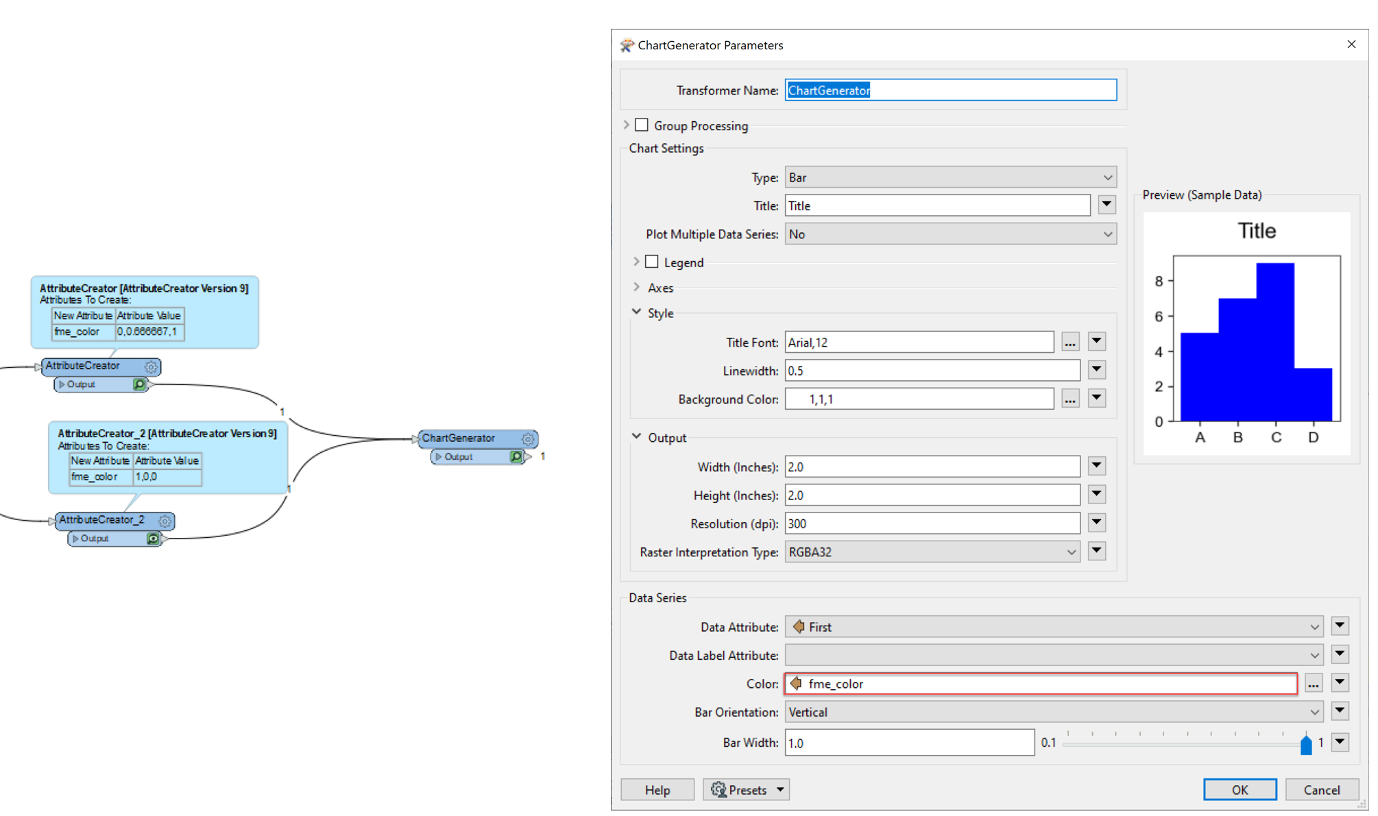
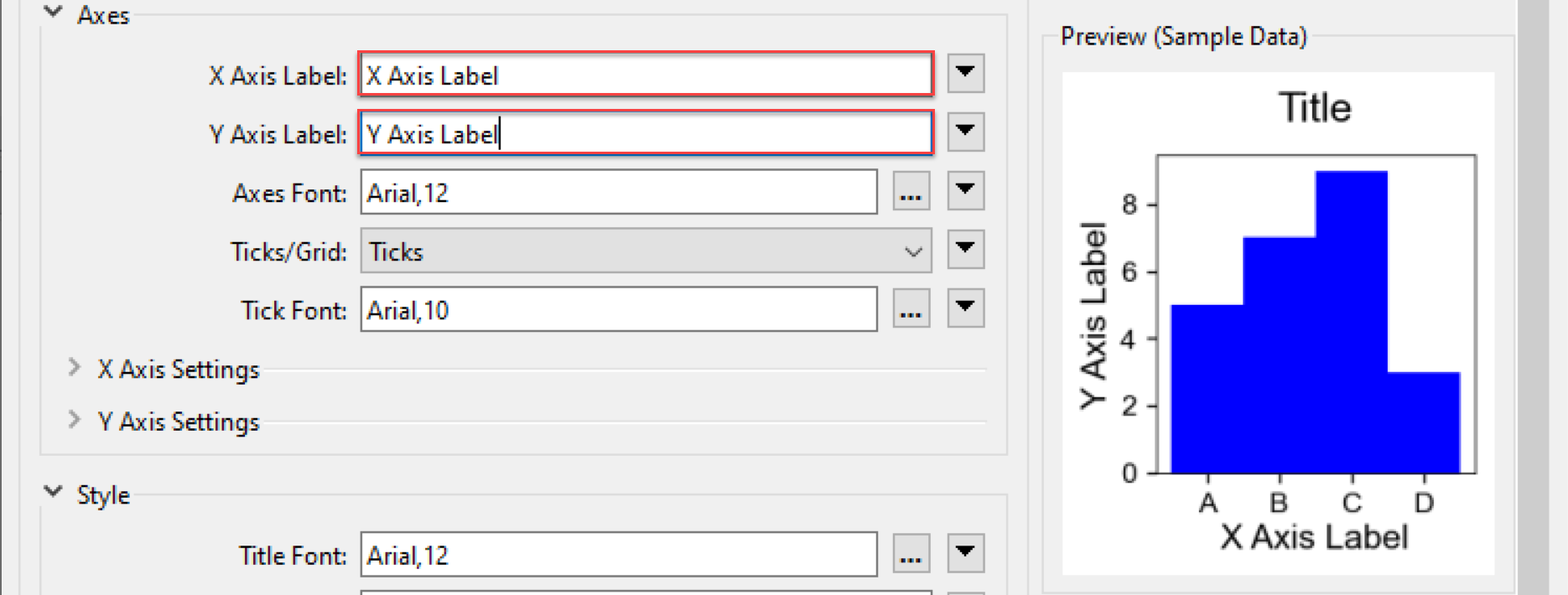
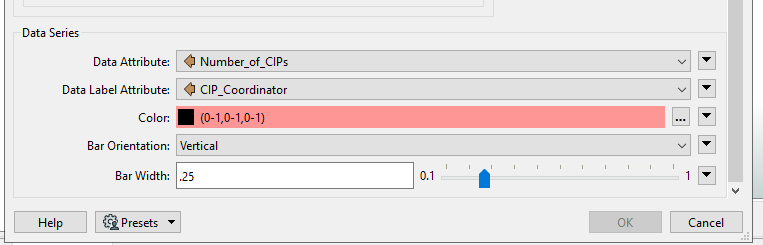
I'm working with the ChartGenerator Transformer to create a bar chart and have two questions:

1) How can I change the bar colour so each bar is a different color? I did find a post to change the RGB to (0-1,0-1,0-1), but my entry is still pink, so I can't use that.

image
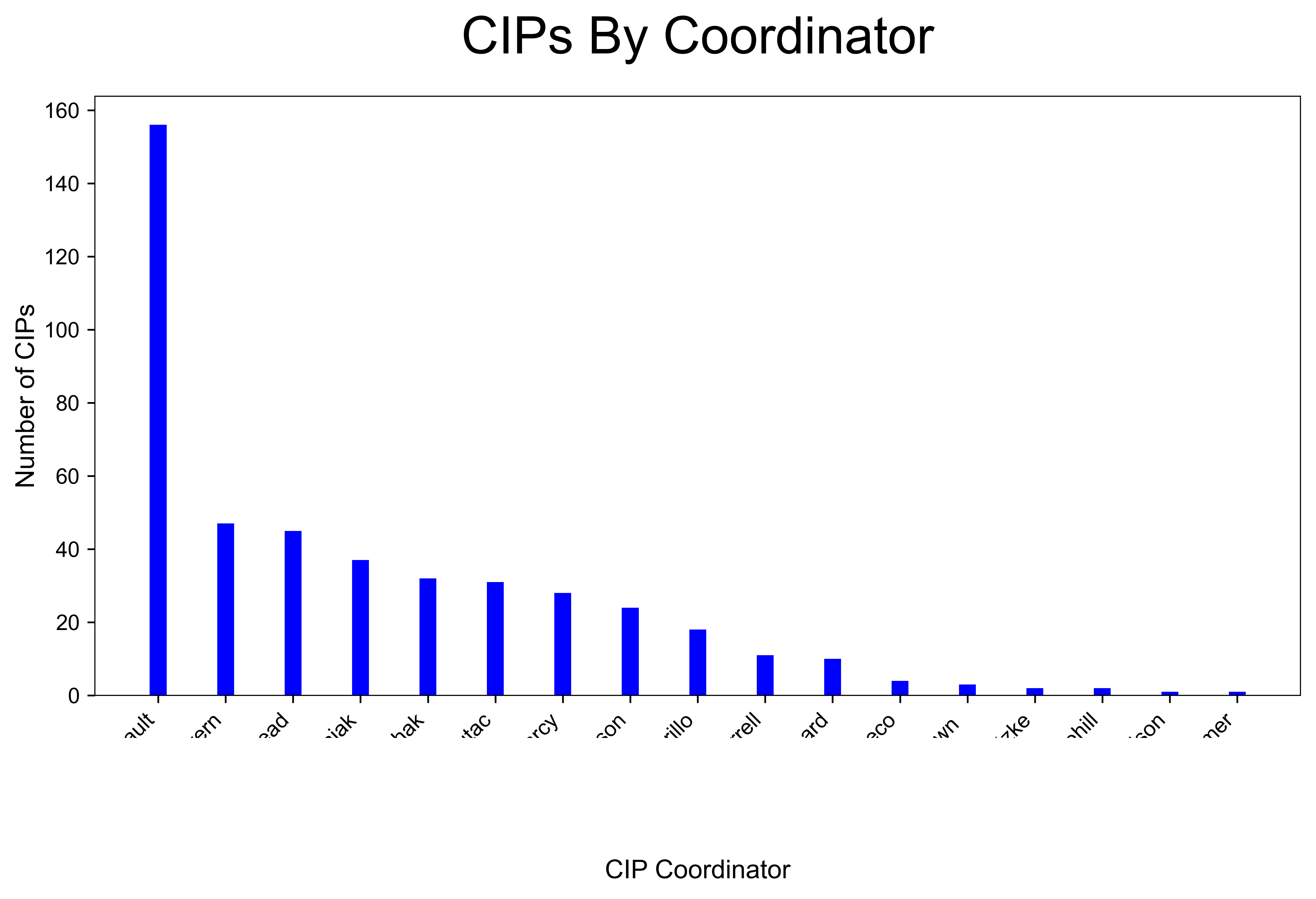
2) How can I add a label showing the number of items at the top of each bar? The PowerPiontStyler has an option for "Label Data", but I don't see one within the ChartGenerator. Currently, my table is shown like this:

imageThanks in advance!

1 reply

kailinatsafe
Safer
Forum|alt.badge.img+19

Hello @stefan_kutac​, thanks for posting!


How can I change the bar colour so each bar is a different color? 

If we take a look at the ChartGenerator documentation, and navigate to Colour parameter under Bar section, we see that color values need to be written like "0,0,1". For example, if I wanted my bars to be red I would enter: 1,0,0


For styling individual bars with unique colours, we can assign unique colour values per feature to the fme_color attribute, and assign this attribute in our ChartGenerator for Color like this:


image 

This will output a bar chart with different coloured bars.


How can I add a label showing the number of items at the top of each bar?

There is actually a parameter section for this in the ChartGenerator! If you open the ChartGenerator parameters > Axes > you should see X / Y Axis Label fields, which sets the label along the X/Y axis.


image 

Let me know if you get stuck somewhere, happy to help! Kailin.


Cookie policy

We use cookies to enhance and personalize your experience. If you accept you agree to our full cookie policy. Learn more about our cookies.

 
Cookie settings