Hi,
Yeah, this was an old wish, to be able to easily see the difference between the FME Flows on the tabs in a browser when multiple FME Flow servers are running, e.g. for development, testing, acceptance and production (DTAP).
See also this question: FME FLOW 2023, Is there a way to change the color of the blue ring logo on the browser tab icon?
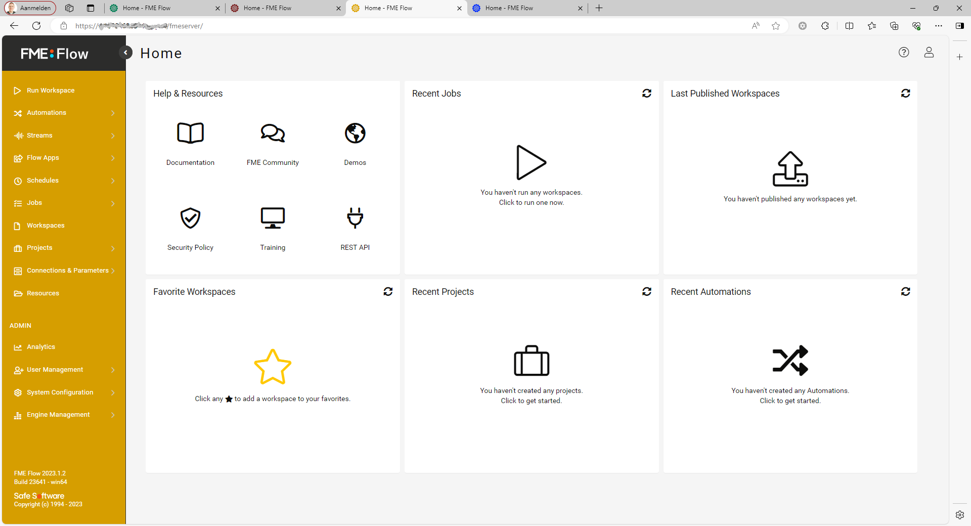
We took it even one step further - see image below
Two simple changes: a different color for the icon on the tab and for the bar on the left hand side.
- to modify the icon you will need to have access to:
<FMEFlowDir>\Utilities\tomcat\webapps\fmeserver\images\favicon-fme-flow.svg
The (one?) good thing about the new FME Flow logo is that it is monochrome, so it is easy to modify favicon-fme-flow.svg (with an SVG editor, for example Inkscape) to set a different color.
- to modify the color of the sidebar you will have to edit
<FMEFlowDir>\Utilities\tomcat\webapps\fmeserver\styles\safe-software-app.min.css
Search in this minified CSS file for
.sidebar{margin-right:0!important;background-color:#2C2C2B;and
.sidebar>ul.nav{background-color:#2C2C2B}respectively and change the color #2C2C2B in both cases to the color of your choice, e.g. #D69E00, the same color you used for the icon in favicon-fme-flow.svg.
Repeat these steps for each environment, of course using different colors, and - yee-haw! - you will be able to easily switch in your browser between your different FME Flows.
What do you think?
Cheers,
Egge-Jan


