


I am trying to make an overview of crosssections of infratsructure (a levee). I would like to plot all crosssections in 1 graph in excel.
I managed to make 1 excel per cross section, but I would like to plot them a bit like this:
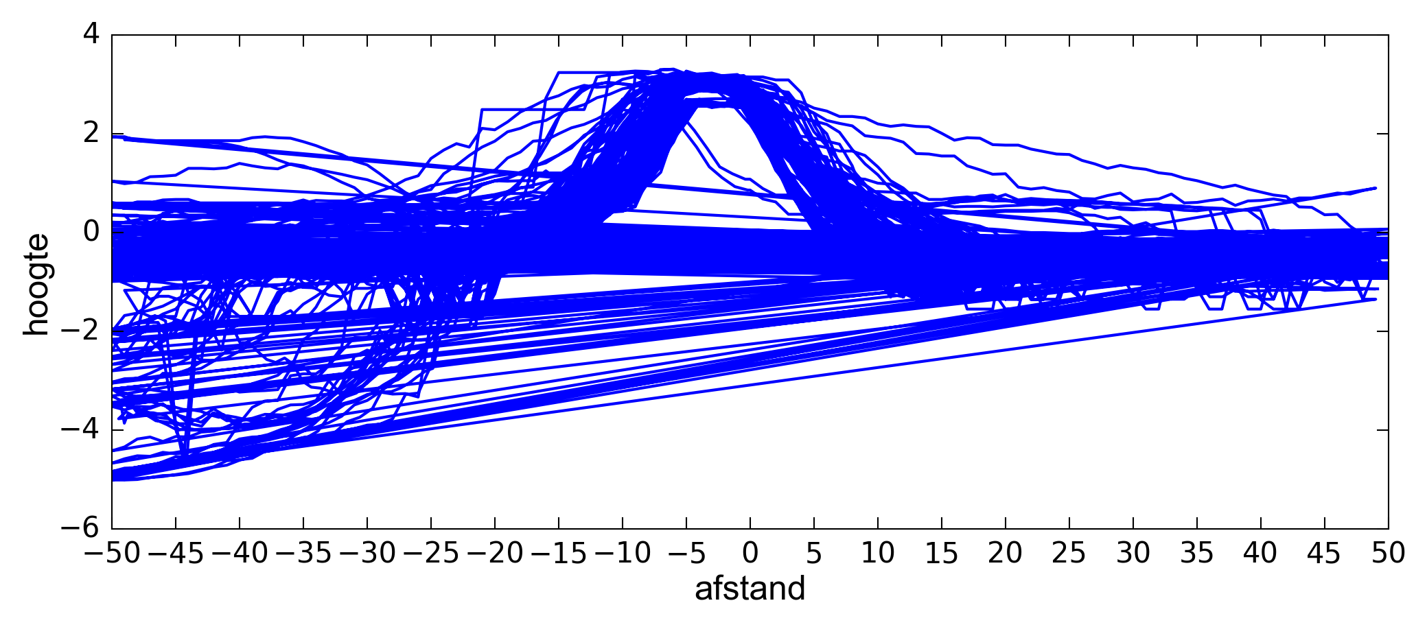
This is made in Fme, but has 2 problems for me:
- 1: I can't 'turn off' certain cross sections since it's a png (that's why I want to do it in excel)
-2: I made an attribute column with cross section number, an x-value (-50 to 50) and a z value. I grouped them per cross section number. This causes the graph lines to go straight back from 50 to -50 on the next profile (the straigh lines). I would prefer not to have those lines.
So: how do I get 1 excel graph with all cross sections on top of eachother without the 'return lines'?