Hi FME'ers - here's an update on new functionality in this knowledge centre, for which I'm shamelessly attempting to copy the style of the Slack Release Notes.
Besides these updates, we're working on other items like custom badges, so we can give all of you the recognition you deserve for FME-specific actions.
FME Knowledge Centre: August 2016 ("Reach for the Stars")
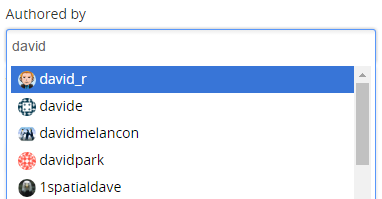
- Colored borders on profile pictures. Are these users targeted for something? Yes! Aim your questions at them. Orange means the user is a Safe Software employee. Green means an official Safe Software partner. We know everything. Go on, try us!
- Stars on profile pictures are like a Walk of FaME! It means they are certified FME'ers. From left-to-right the stars mean Certified Pro, Certified Trainer, Certified Server Pro. Only @aaronkoning has the Server Pro star because he whined until we gave it him. Everyone else will need to take the exam!
- The Refine Search dialog was a shy creature that only appeared now and then. It's been given an ego boost and now appears all the time. It also updates automatically based on whether you are looking at Ideas, Articles, or Q+A.
- Knowledgebase article icons got a tooltip, so you can tell an FAQ from an Error from a How-To. It's not much but the icons are happy, and if they're happy, you're happy; right?
- Profiles now show "accepted answers" as an absolute number, not a percentage. Because just one accepted answer doesn't make you 100% perfect. At least, not any more!
- We've upgraded to AnswerHub 1.6.4 making the knowledge centre platform more stable. Neigh!
- The long list of categories (spaces) on the right-hand side of the page has been removed. Because no-one ever reads to the end of a long list of items. Am I right? Oh... is anyone still there?
