Question

Tick interval greyed out in ChartGenerator


Badge

HistogramHi!

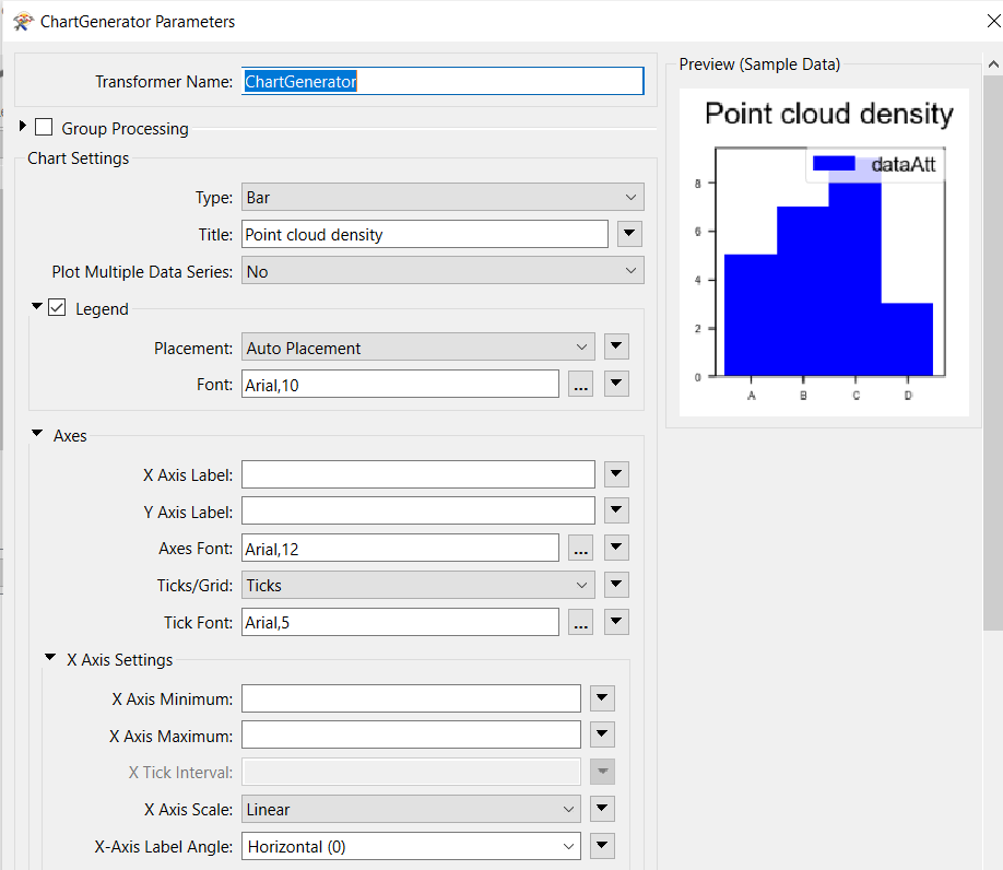
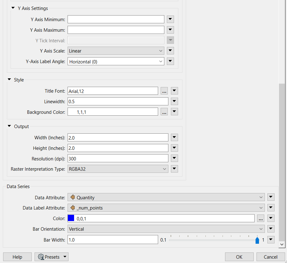
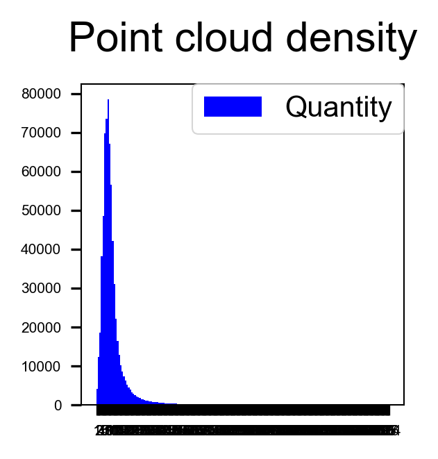
I am a beginner and trying to calculate a histogram showing point cloud density. I succeeded in creating a bar histogram with the ChartGenerator, however, I have problems with the label, especially the x axis. The x axis shows the number of points 1...394. As you can see the x tick interval is probably 1, but of course I would like to change this to a bigger interval

The only problem is that the x and y tick interval is greyed out.

Does anyone know why and how I can activate this?


I upload an image showing the histogram I get as well as the properties of the ChartGenerator.


Thanks in advance!chartgenerator1chartgenerator2


3 replies

Userlevel 2
Badge +10

Hi @ingridantonsen​ the X Tick Interval and the Y Tick Interval are greyed out because you are using the Bar Chart Type. If you were to change the Type to Histogram, then you are able to set these parameters. If you would like I can see if we're possibly able to make the X/Y tick intervals available to the user through an update? Unfortunately there is no way to make it available at the moment.

Badge

Hi @ingridantonsen​ the X Tick Interval and the Y Tick Interval are greyed out because you are using the Bar Chart Type. If you were to change the Type to Histogram, then you are able to set these parameters. If you would like I can see if we're possibly able to make the X/Y tick intervals available to the user through an update? Unfortunately there is no way to make it available at the moment.

Thank you very much for your reply, @danminneyatsafe. I would appreciate if you could consider making tick intervals available through an update.

Instead of using "bar" , I tried "histogram" but unfortunately I was not able to achieve the result at all, maybe you could help?

Data attribute: Quantiy (that means the number of cells which contains a certain number of points)

Number of bins: Length(@Value(num_of_points)) --> num_of_points (number of points in a cell)

result: a square (it should be a shifted gaussian histogram)

Userlevel 2
Badge +10

Thank you very much for your reply, @danminneyatsafe. I would appreciate if you could consider making tick intervals available through an update.

Instead of using "bar" , I tried "histogram" but unfortunately I was not able to achieve the result at all, maybe you could help?

Data attribute: Quantiy (that means the number of cells which contains a certain number of points)

Number of bins: Length(@Value(num_of_points)) --> num_of_points (number of points in a cell)

result: a square (it should be a shifted gaussian histogram)

@ingridantonsen​ I created a ticket to get the X tick and Y ticket interval parameters exposed for the Bar Chart creation. The ticket number is FMEENGINE-77021. We will update you here if the feature is released in a new version of FME.


One thing you could try doing with your Bar Chart is setting the Data label Attribute to a blank value and see if that makes a difference. You could also try changing the Output > Width & Height to make the image larger. Right now it is set to its default of 2x2 inches. If you have a common value that you can group your features by, this would also improve the readability of the bar chart. You can set this with the Group By parameter.


Hope this helps!

Reply