Hello
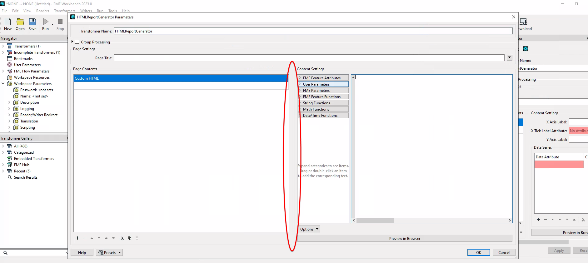
As stated in the title, the left pane takes too much space thus making harder to write / review codes. It basically cannot be resized.
 Noticed this in FME 2023.0.0.3 and 2023.0.1
Hello
As stated in the title, the left pane takes too much space thus making harder to write / review codes. It basically cannot be resized.
 Noticed this in FME 2023.0.0.3 and 2023.0.1
Best answer by saraatsafe
Hi @sameer, update on this: a fix has been implemented as of FME 2023.1 b23611 and you can download the 2023.1 beta here. The panels are more evenly sized and only the Content Settings panel adjusts when the Parameters window size is adjusted. Let me know if there are any questions!