Solved

Can Chart Generator axis values be displayed in scientific notation?


Badge

Hello,

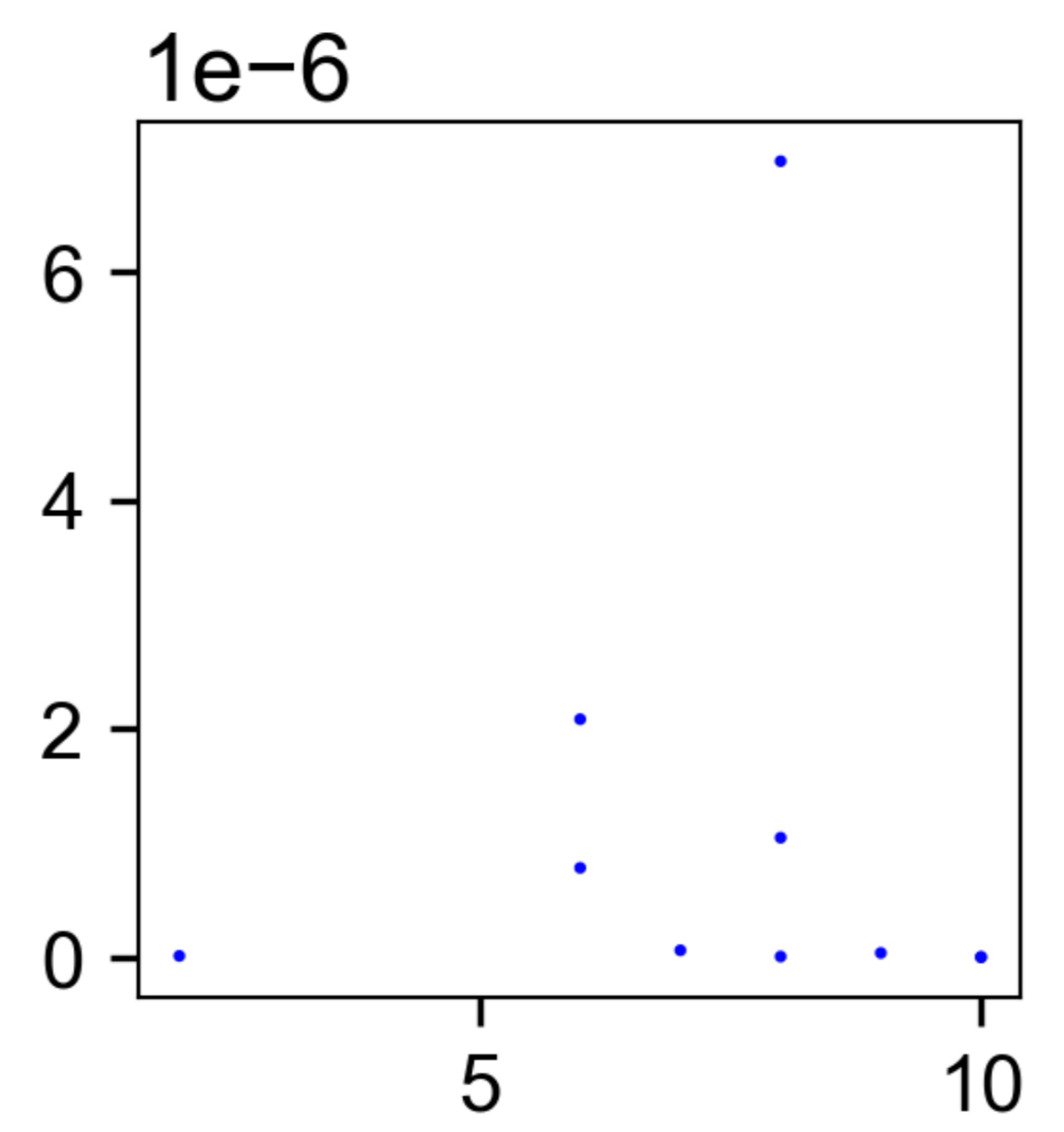
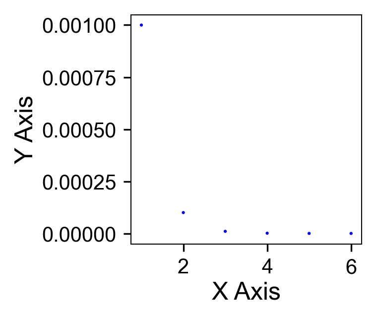
I am using the chart generator with some small numbers to make a scatterplot. I can't figure out how to display the axis values in scientific notation. See the example chart generator output image below using some made up values. The Y axis values range from 1.0e-3 to 1.0e-9. I would like to change the axis values to scientific from decimal.


Thanks for the help


Sheet1 

icon

Best answer by daveatsafe 2 March 2023, 00:19

View original

2 replies

Userlevel 2
Badge +17

Hi @David Birkigt​,

You can use the StringFormatter transformer with a Format String of e to convert your numerical values to scientific notation strings before the ChartGenerator. The ChartGenerator will interpret these correctly and create a chart similar to this:

Screen Shot 2023-03-01 at 3.15.22 PM

Badge

Hi @David Birkigt​,

You can use the StringFormatter transformer with a Format String of e to convert your numerical values to scientific notation strings before the ChartGenerator. The ChartGenerator will interpret these correctly and create a chart similar to this:

Screen Shot 2023-03-01 at 3.15.22 PM

Appreciate the help. I messed around with e and TCL (not enjoyable) for a bit. I am not quite getting the format I want so I'll probably pursue another charting option.

Thanks

Reply