Pl. see data in attached Excel file. I am able to obtain the data ready to plot histogram as shown in the attached Excel file. The further steps to plot histogram is where I am stuck.


Userlevel 4
 +30
+30
- Evangelist
- 1873 replies
-
20 August 2017

Hi @bey_atkins2009,
The transformer ChartGenerator is interessant in your case.
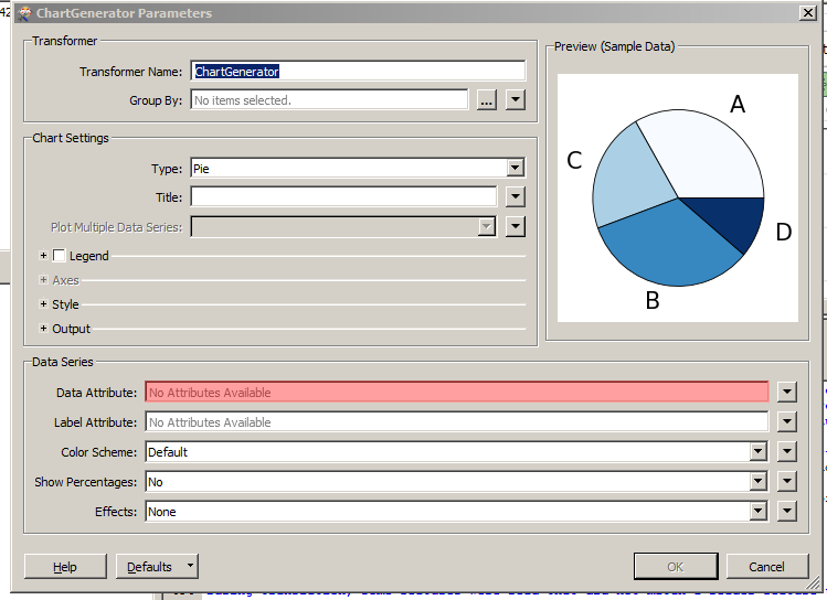
You can find the documentation Chart Generator.
Thanks,
Danilo


Userlevel 3
 +13
+13
- Contributor
- 3701 replies
-
23 August 2017

Hi @bey_atkins2009, are you wanting a graphical histogram or a summary table like you've shown in your Excel? Also, what format do you want to write the histogram to?
 +2
+2
Hello @bey_atkins2009,
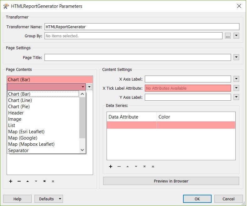
In addition to @danilo_inovacao good recomendation you can use the HTMLreportGenerator to generate and display your charts in an HTML page using FME Desktop.
Cheers.
Lyes
Hi @bey_atkins2009, are you wanting a graphical histogram or a summary table like you've shown in your Excel? Also, what format do you want to write the histogram to?
Userlevel 4
+30
- Evangelist
- 1873 replies
-
23 August 2017
Hi @bey_atkins2009, could you share us your Workspace template ( . fmwt ) ?
Thanks,
Danilo
Hi @bey_atkins2009, could you share us your Workspace template ( . fmwt ) ?
Thanks,
Danilo
test.zip
Userlevel 3
+13
- Contributor
- 3701 replies
-
23 August 2017
Hi @bey_atkins2009, using the ChartGenerator like @danilo_inovacao suggested should give you the output you're after. I created the following using the transformer:
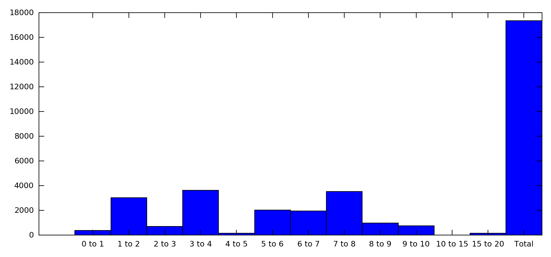
I set the Chart Type to Bar in order to label with your range values.
EDIT: The Data Attribute was set to Number and the Data Label Attribute to Range.
Userlevel 4
+30
- Evangelist
- 1873 replies
-
23 August 2017
Hi @bey_atkins2009, using the ChartGenerator like @danilo_inovacao suggested should give you the output you're after. I created the following using the transformer:
I set the Chart Type to Bar in order to label with your range values.
EDIT: The Data Attribute was set to Number and the Data Label Attribute to Range.
Reply
Enter your username or e-mail address. We'll send you an e-mail with instructions to reset your password.